This website
What does a portfolio look like when the designer instruments it like a product?
01Scope
50
event names in the tracking plan, six of which decide anything
39
components, thirteen content files, one accent colour
89
logged decisions, the reversals written down with the rest
Counted from the repository on 22 September 2026.
02What it is
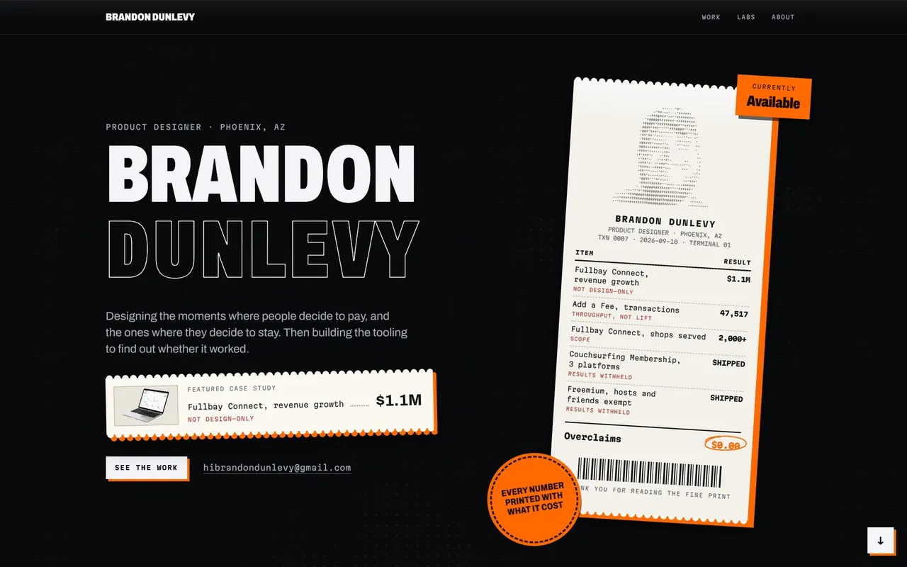
The site you are reading. Next.js 16 and React 19, Tailwind 4 with a numeric type and spacing ruleset, three fonts, one accent colour. A dark ground of drifting glyphs with paper objects on it, and a hard orange offset under every piece of paper.
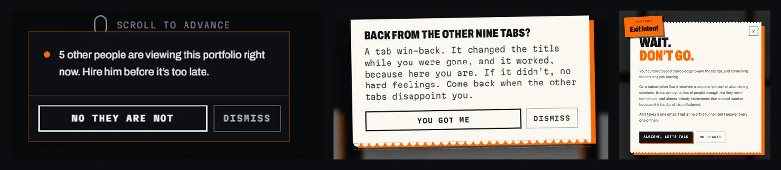
It runs the conversion tactics it talks about and names them: a tab win-back that changes the title while you are gone and says so when you are back, a social-proof card that explains itself when asked, an exit-intent modal, a 404 page that is a paywall with a decoy plan. Each tactic on it is also its own annotation.
One contact click by a person in the thirty days to 17 September, and no email behind it
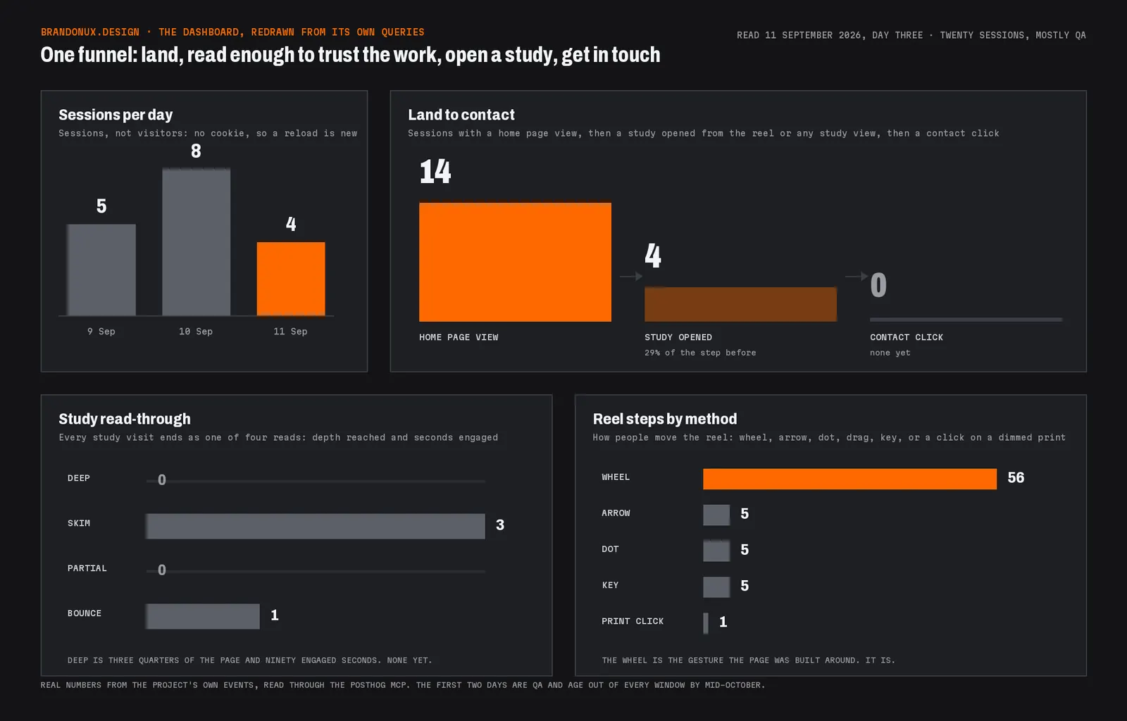
It is also the home page thesis carried out: design the moment, then build the tooling that says whether it worked. The tooling here is the site's own analytics, and the number it reports is whether you got in touch. That number is zero. One contact click by a person in the thirty days to 17 September, and no email behind it. It read as three until I checked. The contact card in the reel is a mail link, and clicking it while a different card is current steps the reel instead of opening anything, which the analytics counted as contact all the same. So now it counts only a click that opens something. The site is a set of case studies, not a lead form, so contact is not the number I run it on. It is the number this study said it would report, and zero belongs on the page the same way the dashboard's $0.00 of overclaims does.
03The home page
Three screens and a dock, one gesture apart. The rule is that a gesture moves a whole unit, never a partial scroll: a wheel flick from the hero opens on the reel, a flick from the reel's last card opens on the references. The hero is the name, the thesis, the strongest public figure with its counter-metric, and a paper with a dot-matrix face, line items with their red caveats, and a total of overclaims at $0.00. The reel is a pinned snap track of paper cards, one per study, with a two-line headline on the left that rolls when the card changes. The references are eight LinkedIn recommendations as cards, picked from thirteen, and every word of the eight is on his public profile where a visitor can check it.
None of the tactics gets a confirmshaming version
When the tab goes into the background the title reads 'the designer to hire' and the favicon blinks between the paper icon and its orange inverse once a second, the fastest rate a hidden tab allows. Come back and the title says 'Back from the other nine tabs?' for four seconds. The first time a browser comes back, a slip drops in with the note and stays until it is dismissed, and that browser will not see it again. The social-proof card fires once the reel enters the viewport, never in the first ten seconds, and the button under it says 'No they are not', with the honest explanation. The exit-intent sheet names the tactic and gives both numbers, and its decline is 'No thanks'. None of the tactics gets a confirmshaming version.
04Analytics without a banner
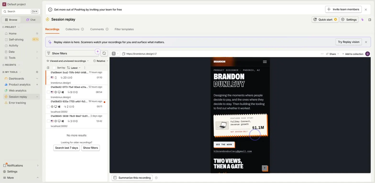
One vendor, PostHog, loaded through a first-party path so ad blockers, which recruiters run more than most, do not see it. It keeps one first-party id in the browser's local storage and nothing else: no cookie, no identify, no profile, so a return visit on the same browser counts as the same visitor. A different device does not. Until the resume experiment it kept nothing at all, and every reload was a new visitor. US visitors only. The site exists to get me hired in the US, and a country check runs before the SDK starts. Session replay stays on with inputs masked, because replay was the reason for the vendor and the first attempt, PostHog's cookieless mode, switched it off silently. That reversal is in the decisions log.
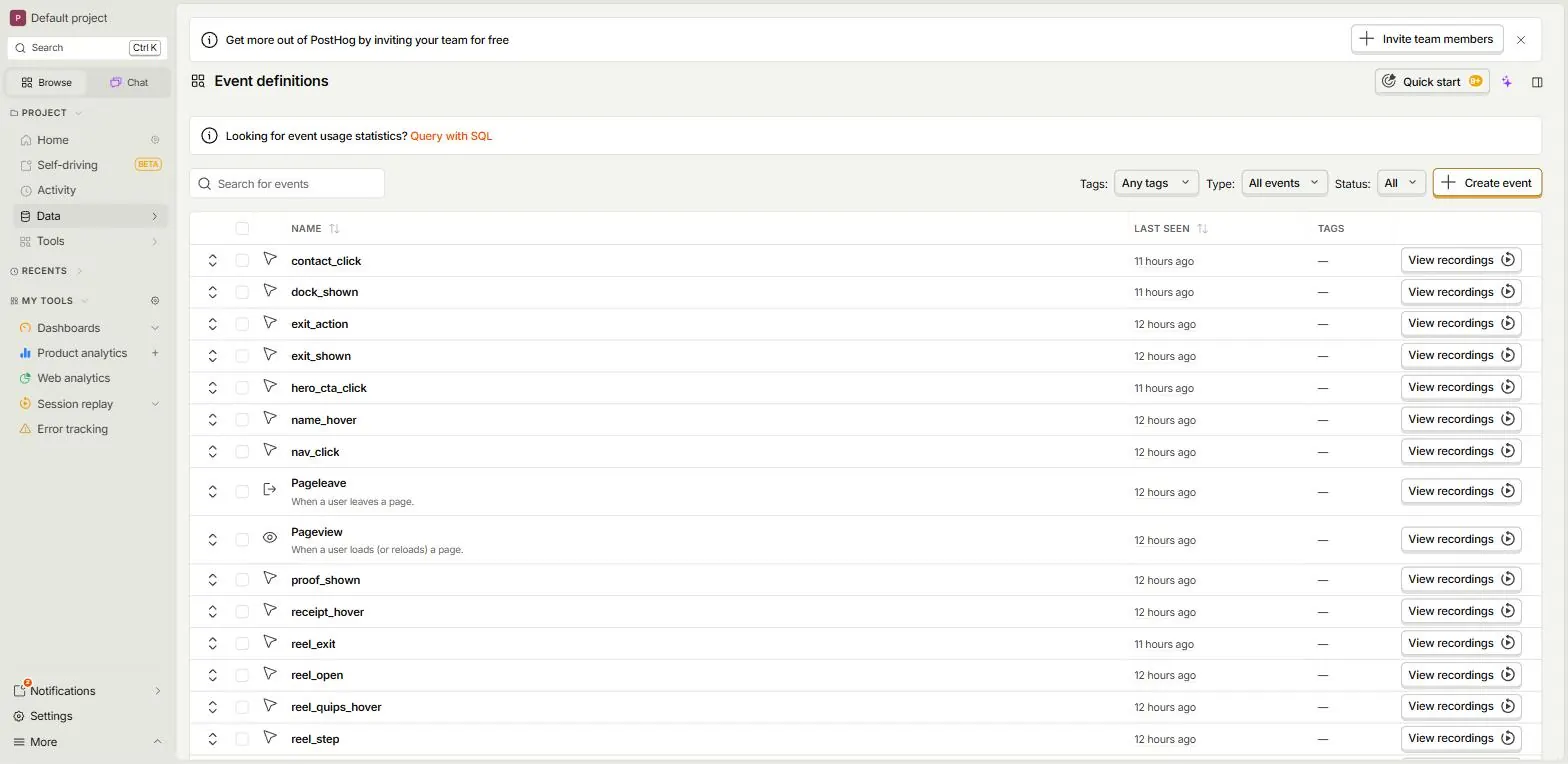
The tracking plan came before the tracking code. Fifty event names, object then action, and one rule for adding one: when this fires, what do we do about it? Six of them decide anything, a contact click, a deep read of a study, a study opened from the reel, a reference opened, the hero button, a study page view. Everything else explains a number on the dashboard. Engaged time counts only while the tab is visible, the window is in front, and the last scroll or key was under five seconds ago, and every study visit ends as deep, skim, partial or bounce.
It skips a privacy notice, a do-not-record control and surveys. Nothing on the page should put a hiring manager off. Browsers sending Global Privacy Control get no vendor at all. Nothing is sold to the person on the page. They are evaluating me, and the site is measuring whether its own pages work for them. The one real exposure in the setup, session replay under the California wiretapping suits, is written down in the analytics doc with the one-line switch that turns replay off.
05Humans and machines
Twenty resumes went out with a tagged link, one campaign per company, to answer a question I had never been able to answer: does a recruiter open the portfolio, and what happens when they land. The first two tagged visits arrived overnight. Both reported a coarse pointer on a desktop, moved no mouse, pressed no key, produced no recording, and left within seconds. One came from San Jose, the other from nowhere the lookup could place. Every coarse-pointer desktop session in the first week was the same kind of thing, including one from Google's data center in Iowa and one claiming a browser version that does not exist.
The dashboard would have said two resume visits, and I would have believed the link worked
Link scanners in applicant tracking systems and mail security open every link in a resume before a person ever sees it. The dashboard would have said two resume visits, and I would have believed the link worked. As of 17 September, five of the twenty links have been opened by a scanner and one by people, two of them at one agency: a recruiter, who came back once, and a colleague of theirs. That is the count after the human check, and it is early. Most of the twenty went out in the second week of September. So far the answer is one agency.
So the site now tells them apart in the data. Every event says whether the browser has touch points, and a human event fires on the first real interaction of a page load, a mouse move from a fine pointer, a key, a wheel tick, a touch, or a scroll that moved. Everything after it is marked human. A person who arrived from a resume is a session with the tag and that event. The first afternoon it was live, Microsoft's link scanner got past it three times with a fake cursor, from two of its data centers, so a mouse now has to travel before it counts, and a window with no browser around it is marked as a likely sandbox. A scanner still counts, as proof the resume reached a system that opens links.
let human = false;
export function markHuman(via: string): void {
  if (human) return;
  human = true;
  track("human", { via });
}

export function context(): Props {
  const w = window.innerWidth;
  return {
    path: location.pathname,
    viewport: w < 640 ? "phone" : w < 1024 ? "tablet" : "desktop",
    pointer: matchMedia("(hover: hover) and (pointer: fine)").matches ? "fine" : "coarse",
    // A coarse pointer on a desktop with no touch points is a headless
    // browser, not a person; touch makes that rule a filter.
    touch: navigator.maxTouchPoints > 0,
    human,
    reduced_motion: matchMedia("(prefers-reduced-motion: reduce)").matches,
  };
}
The flag on every event, and the event that flips it. The verdict on who is a machine stays in the query, where it can change without a deploy.
One visit arrived with the link's ampersand HTML-escaped by whatever pane rendered the resume, so the campaign came through as nothing. The address is now repaired in place before anything reads it. And scroll depth had been counting the viewport itself at load, so a page whose first screen was a quarter of the whole sent 25 with nothing scrolled. A third of that bucket in the first week was the artifact. Nothing fires now until something has moved.
The site had kept nothing at all in the browser, which made every reload a new visitor and made a recruiter coming back on Thursday indistinguishable from a stranger. So now it keeps one first-party id in local storage, no cookie and no profile, which is enough to see a return on the same browser and still nothing that needs a banner in the US.
06The morning post
I would open a dashboard every day for about a week. So the site reports to me instead. A cron calls a route at 6:30 Phoenix time, the route runs nine queries against PostHog for the previous day, draws a card in the same type and palette as the share image, and posts it to a Discord channel with four lines of plain text: visits and how many were people, resume arrivals by company marked person or scanner, study reads by tier with the most-read study named, and engaged time, top source and errors. A day with no visits still posts. A run that fails posts a red line saying so, so a missing post never passes for a quiet day.
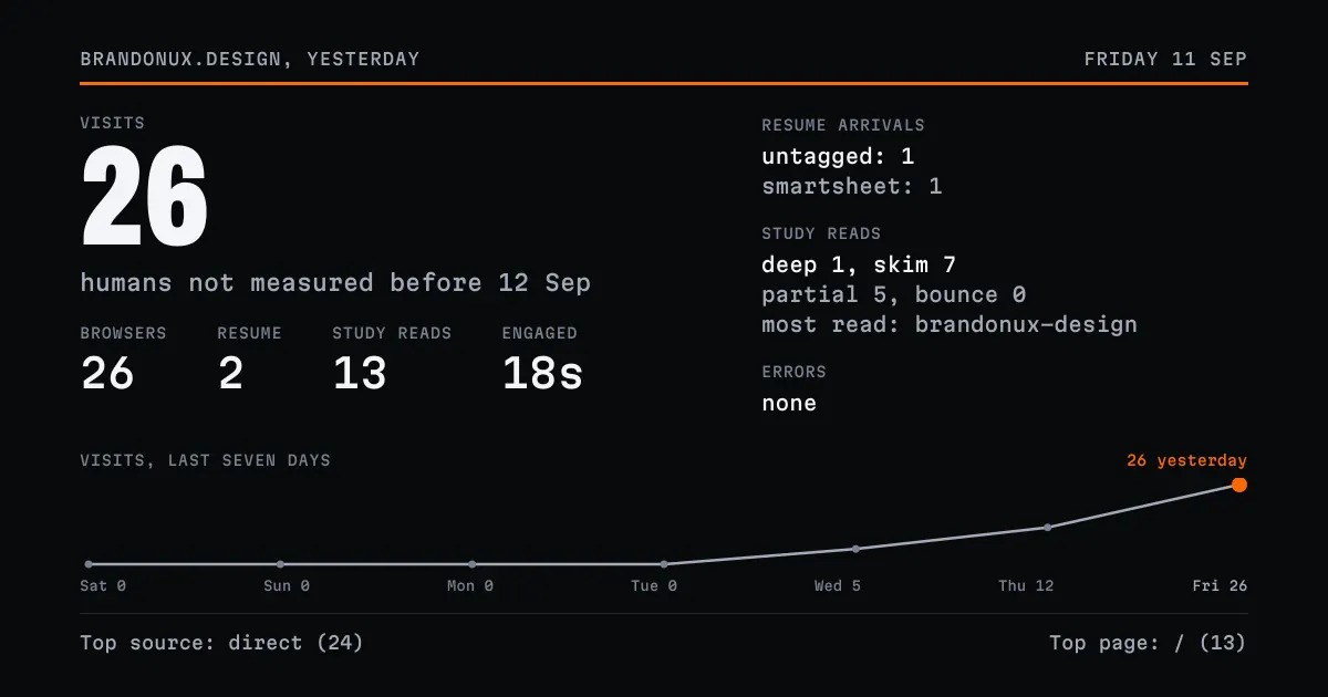
The first version of the text was a monospace ledger with aligned columns, which looked right on a desktop and turned to noise on a phone, where Discord wraps code inside an embed. The columns moved onto the card, which cannot wrap, and the text became four sentences a person might say. The figures are labelled with care. Visits are sessions, and the visitor count is called browsers, because a first-party id is a browser and not a person.
07What the replays taught
Replay went in for the recruiter question and then answered a different one. The first week of recordings had thirteen showings of the exit modal. Two came at 19 and 24 seconds into a first visit, and both readers left on the spot with no click and nothing after. The ones that came minutes in were closed and the reader went on, three of them into more studies. The gate was six seconds on the page and 300 px of scroll, which a fast scroller clears before a sentence. So now it is 45 seconds and half the page, and each showing records how far in it came so the gate can be checked again. No tactic on the site has been followed by a contact click in the data. The tactics are here to explain themselves rather than to convert.
One visitor from a Google search stepped the reel, pushed the pointer over the top edge, got the modal, switched tabs a second later and came back to the win-back slip sitting on top of it. The two now share a floor. Whichever is up holds it, and the other waits or skips. One reader met the social-proof card twice in one visit, once on landing and again after a trip to About, because the card remembered a dismissal and nothing else, and only for the tab. A dismissal is now kept for the browser, a showing for the tab, and the card leaves when the home page does instead of riding onto a study and covering the index. I caught the last one myself. The slip fired on a refresh, so a reader moving between studies met it on each one. It is a one-time joke and it shows once per browser. The title swap and the favicon blink keep running, since that is the part that does the work.
const holders = new Set<string>();

export function claimAttention(who: string): void {
  holders.add(who);
}

export function releaseAttention(who: string): void {
  holders.delete(who);
}

/** True when anything other than `except` holds the floor. */
export function attentionHeld(except?: string): boolean {
  for (const h of holders) if (h !== except) return true;
  return false;
}
The floor the exit modal and the win-back slip share. Module state, per page load, no provider.
One reader produced 143 dead clicks across four studies in an hour, all of them on paragraphs. Some people click the line they are reading. Nothing to fix. The Fullbay study reached a deep read in that session.
08The ruleset
- 01Two type ratios: about 1.2 through the text range and 1.25 to 1.333 through the display range, fluid between 320 and 1440, no two steps closer than 25 percent
- 02A 4px base with an 8px layout rhythm: every value divisible by four, layout values by eight, so the Tailwind camp and the Material camp are both satisfied
- 03Within-section spacing two to three times tighter than between-section spacing, and proximity by halving gaps: 32, 16, 8
- 04No interactive target under 24 by 24, which is the WCAG 2.2 floor and a legal floor rather than a target. Primary and mobile controls at 44 to 48
- 05Contrast is computed rather than eyeballed. The pre-ship checklist has twenty items and that is the last one
09The content model
A study is data: a slug, a question, a three-line summary, a cover, and sections of typed blocks. The block kinds encode the storytelling rules so they are hard to skip: an impact block reports each metric on its own line with the counter-metrics beside the ones that went my way, an attribution block follows every impact and says what the design can and cannot claim, a withheld block says a number exists and why it is not here. A draft renders in development and is a 404 in production. An ask block is a question for me, drawn as an orange note, and the build refuses to publish a study that still carries one, so nothing goes live half-answered.
Two more kinds arrived after a review pass: the dropped block strikes each cut idea through with the reason in my hand, and the dials block is an empty instrument panel for the metrics I never got to read. Both exist because two sections on every study were paragraphs that felt flat, and the fix was a form.
export type Block =
  | { kind: "text"; body: string[] }
  | { kind: "media"; src?: string; alt: string; caption?: string; wide?: boolean; swipe?: boolean }
  | { kind: "impact"; metrics: Metric[] }              // each metric on its own line, counter-metric beside it
  | { kind: "attribution"; attribution: Attribution }  // what the design can and cannot claim
  | { kind: "withheld"; body: string; available?: string } // a number exists, and why it is not here
  | { kind: "dropped"; items: { cut: string; why: string }[] }
  | { kind: "dials"; items: { label: string; unit: string; how: string }[] }
  | { kind: "ask"; body: string }                      // a question for me; the build refuses to publish with one
  | { kind: "scope"; items: { value: string; label: string }[] }
  | { kind: "code"; file?: string; code: string; caption?: string };
The union, trimmed to the kinds that carry a storytelling rule. The renderer has one case per kind, so a study cannot invent a shape the rules do not know.
10Decisions, and what was cut
- 01The About page was chosen from four treatments built and compared live on the site. The other three are in git. The family page came from five. The labs index from four
- 02Page transitions: twelve mocks built (shared print, paper feed, stamp, ink settle, tear and pin, tear-off, scan, fold, print head, roll, ink flood, curl) and none kept. The flatness was the page appearing in one frame. A 180ms fade fixed that without becoming a thing
- 03Two studies and the Work index were cut in one sitting because they were the weakest of the set. Their content is in git at a named commit
- 04Microsoft Clarity was in the analytics plan and was dropped: it sets cookies, duplicates the replay, and is the tool named in the lead US replay lawsuit
- 05The reel's snap area is an unscaled slot around each card, because the card's own scale used to move the snap point after landing. That fixed the bounce
11How it was built
There is no test suite. Verification is a real browser against the dev server at 1900 and 390 wide, with a real mouse wheel for the reel because a synthetic wheel does not scroll it, and a screenshot of every touched screen before anything is called done. Some things a headless browser cannot see at all: a tab going hidden, which the favicon blink depends on, was verified by driving plain Chrome and photographing the window.
Eight deep research runs fed the decisions, each with a few hundred sources and an applied line tying what it found to what changed: the type ruleset, the analytics stack, how case studies are read, replay consent law, general product analytics practice. The dashboard was built through the PostHog MCP from the tracking plan. A live punch list with persistent checkboxes tracked the last pass before the DNS switch, and the decisions log, eighty-nine entries and counting, is the file a new session reads first. I used AI tooling to ask and to find the plot holes.
Things that went wrong and are written down so they do not happen twice: a CSS syntax error mid-edit leaves the dev server serving 500 after the fix. Unlayered CSS beats the utility layer without a warning, and did it to nav colours and hero tracking. The dev server adds a second pair of icon links after mount, so the favicon swap has to look them up every time and re-insert them.
// Engaged time counts a second only while the tab is visible, the window
// is in front, and the last scroll, pointer or key was under five seconds
// ago. A tab left open does not read as reading.
const tick = window.setInterval(() => {
  if (document.visibilityState === "visible" && document.hasFocus() && Date.now() - lastActive < 5000) engaged += 1;
}, 1000);

// Leaving a study, the visit ends as one of four reads.
const tier =
  maxDepth >= 75 && engaged >= 90 ? "deep"
  : maxDepth >= 75 && engaged < 40 ? "skim"
  : engaged < 10 ? "bounce"
  : "partial";
track("study_read", { path, slug, tier, engaged_seconds: engaged, max_depth: maxDepth });
The read tiers, trimmed from the file. Deep is three quarters of the page and ninety engaged seconds. Skim is the same depth in under forty.
// My own connections never count. ANALYTICS_BLOCK_IPS is a comma-separated
// list in Vercel; an entry ending in * matches by prefix, which is how an
// IPv6 home network is named: the first four groups stay put while the
// host part rotates daily.
export function isBlocked(headers: Headers): boolean {
  const list = blockedIps();
  if (!list.length) return false;
  const ip = requestIp(headers).toLowerCase();
  if (!ip) return false;
  return list.some((entry) => {
    const e = entry.toLowerCase();
    return e.endsWith("*") ? ip.startsWith(e.slice(0, -1)) : ip === e;
  });
}
The whole gate. The same answer keeps my desk out of the analytics and out of the Speed Insights score. Removing the variable turns it back on.
12Weight
Vercel's Real Experience Score read 57 the morning after launch. The number was eight events from the day before the domain moved, all of them QA, and the metric that failed sits behind a paid plan, so I ran Lighthouse against the live page instead. Desktop 94. Mobile 74, with a largest paint of 7.8 seconds simulated against 0.8 observed. The gap was weight, 3.7 MB to a phone. The carousel's Fullbay clip autoplayed, so every visit pulled 1.6 MB whether or not anyone reached it. Five case-study covers were full 1600 to 2000 pixel files in a box 217 pixels wide. The featured thumbnail under the hero was a 3909 by 2416 PNG shown at 99 by 53.
Three changes in one commit. A script writes 640 and 1280 pixel WebP copies next to every cover, and the carousel, the hero, the study sheet and the next-study foot load them through srcset. The lightbox still opens the original. The clip lost autoplay and preloads nothing, and it plays only while its card is near the viewport with motion allowed. On a phone the card in view plays and the rest wait on their first frame. The vitals script mounts only for an address that is not mine, the same list that keeps me out of the analytics, so the score is readers. On the way I found five more full covers downloading from studies nobody had opened: the router prefetches every study the home page links to, and React hoists each study's cover as an image preload. Sizing the study covers fixed the home page without giving up the instant open.
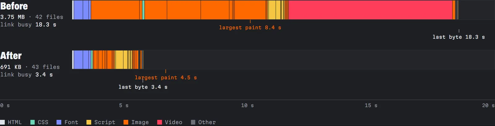
Measured the same way after the deploy: mobile 85 and 3.8 seconds, desktop 100 and 0.7 seconds, 0.69 MB to a phone. What is left on mobile is fonts and scripts, which is a different kind of work. The study pages got the same treatment the next hour: the Fullbay study alone carried 6.6 MB of autoplaying clips, and they now play in view on a hover device and wait for a tap everywhere else.
100Real Experience Score, phone and desktop, the seven days to 15 September, on every page but one
Vercel builds that score from the paint, layout and input timings real visits report, and above 90 counts as great. The site is small and so is its audience, so a handful of slow visits can move it. One page sits under the line. The Fullbay study scored 56 on desktop across a dozen visits, and it is the one page with three clips on it. That is the next thing to weigh.