House2Home
-
DESIGN SPRINT
A New Way To See & Shop Home Decor Ideas
The Client
House2Home
House2Home is a platform for users to purchase home decor items. They believe that everyone deserves to have their dream home, and are here to help make that dream come true. They focus on providing shoppers with the next decor item to create their "perfect" space.
The Challenge
Creating Confidence
Purchasing
New homeowners who want to buy decor pieces to personalize their place are having difficulty envisioning the things within their living quarters. This creates a lack of confidence and remorse when the item(s) don’t look how they expected it in their space. I was given this challenging task and worked on all aspects of the design throughout the sprint.
Day 1
Finding The Solution
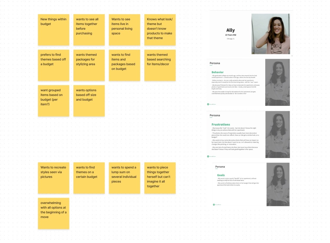
Users really expressed their concerns in terms of finding things within their budget and also being able to envision the item in that space. My solution desperately needed something that incorporated the user’s budget and
home space.

Day 1 (cont.)
Finding The Solution
After creating several user maps I decided on one that really helped walk users through the process of designing their new homes. I found this had the best solution by presenting starter kits and allowing users to place items in images of their homes.
Inspiration
Day 2 (1 of 2)
Inspiration
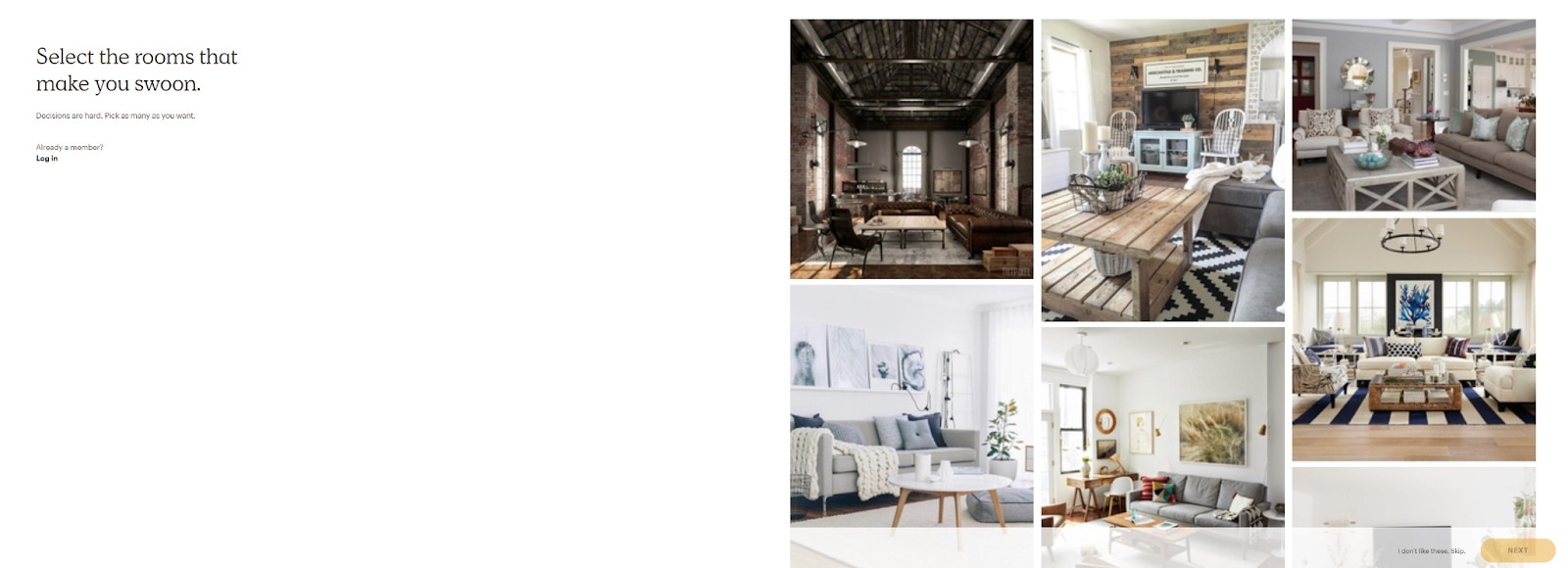
I decided that gaining inspiration from competitors in the industry was important before I began sketching. This would allow me to look at they solving this issue in the space and how I could reiterate on their designs to make a more cohesive experience.
All photos chosen as inspiration had a great take on their own, but it feels like some of them are missing the mark in terms of telling either the customer the price or setting out easy-to-pick themes from their catalog. I knew I could expand on this and make it easier for users to see what something will look like in their homes based on an image.
Day 2 (2 of 2)
Crazy 8s
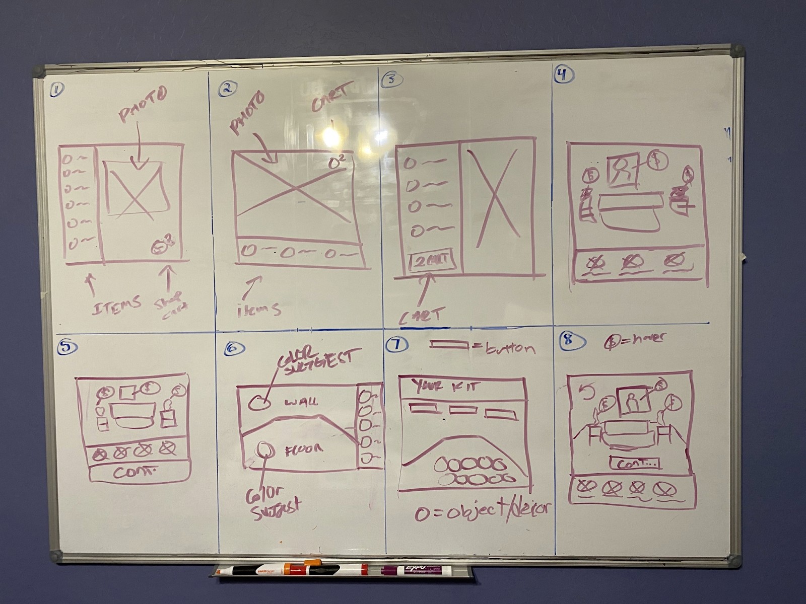
I selected the screen that involves placing objects on your image as the most critical screen as this will be where the most time is spent by users. Having everything flow naturally and being able to take in a lot of information is important at this step of the process as this part has the potential to solve the problem statement. After designing 8 different versions of my screen I honed in on one variation and began cleaning up the sketch.
Day 3
The Journey
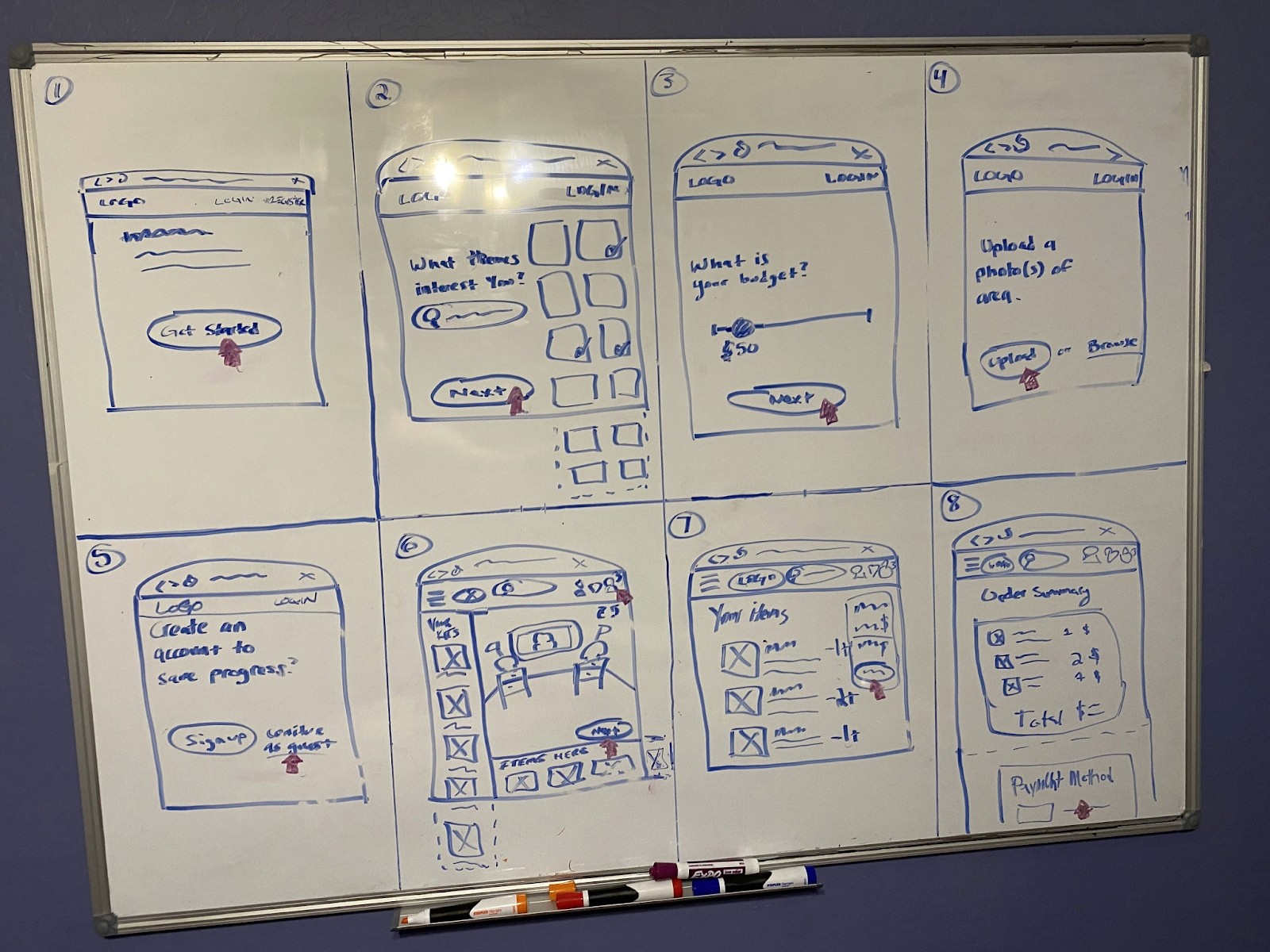
I started creating my storyboard and as I was creating I realized I might have missed a few elements in my original sketch. I also remembered users complaining about how complicated it is when first moving and the overwhelming decisions one has to make, so I made the onboarding as easy as possible to guide them through the process.
Day 4
The Prototype
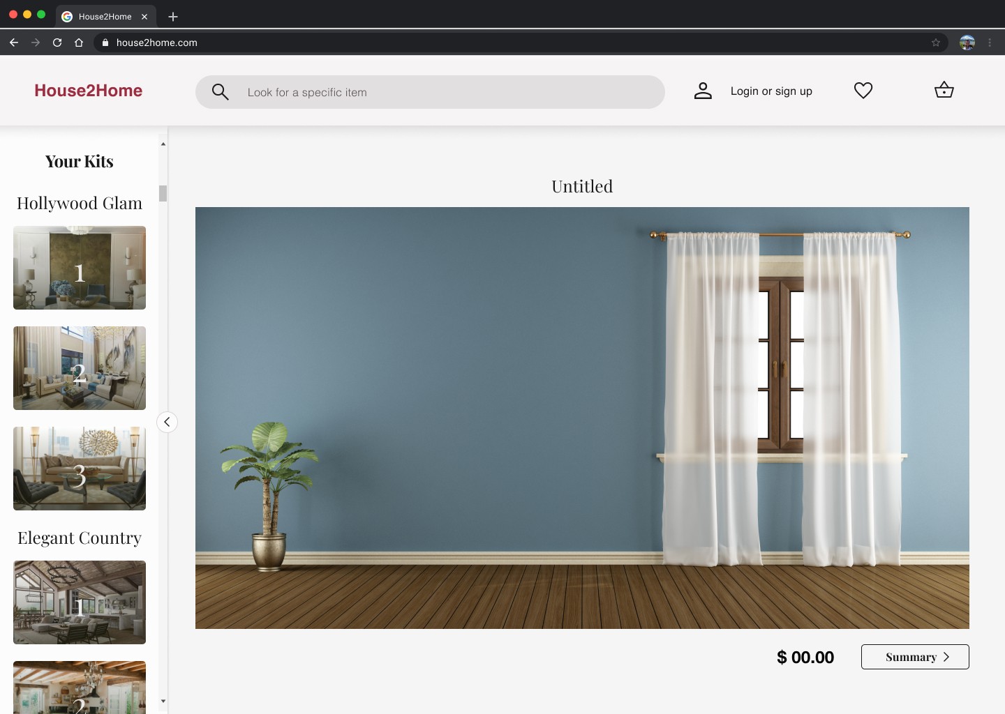
This was by far the hardest part of the design sprint as I purposely gave myself only 6 hours to create my prototype. Although I wasn’t able to include every feature I had in mind as an interactive element it was ultimately a great basis for usability testing.
Day 5
5 Users
30 Minutes
4 Tasks
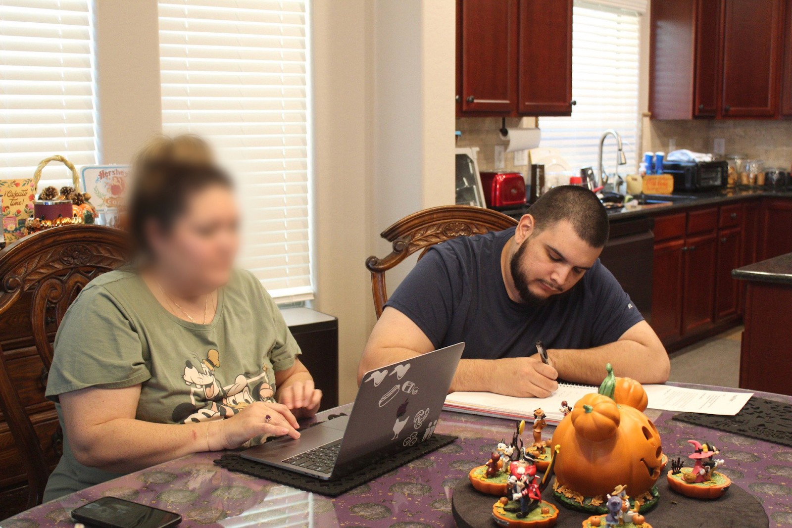
I interviewed 5 users in total who were all either new homeowners or have used a decor website in the past. After conducting my usability test rounds one central affinity found in the prototyping was the wording of elements like “summary” and “your kits” users preferred verbiage like “starter kits” and “checkout”. This was crucial feedback I needed to change in the prototype.
Overall, users admitted the prototype was simple and easy to use. There were no issues with users completing tasks as they all found the prototype to be extremely user-friendly.
