Couchsurfing Membership
How do you sell a membership to people who have stopped buying subscriptions?
WithheldConversion, revenue and cohort magnitudes for this paywall are under my confidentiality obligations and stay there.Where the direction is safe to say, I say it, without the size. This study is the reasoning and the shipped screens.
At a glance
- The problem
Couchsurfing's paywall was asking people to subscribe to a community, in a market where subscription fatigue is the default and the highest-converting model runs on people forgetting to cancel.
- What I did
Benchmarked four paywall models, reframed the offer as a membership, built a choose-your-own-adventure instead of a deck to get a direction out of the CEO, and shipped three variants on web, iOS and Android.
- What happened
Shipped as designed, and B, Find Your Community, won. The reasoning, the shipped screens and the public pricing are here.
01Scope
Conversion after the paywall shipped, against the old paywall. B won the three-way test. The size stays under NDA.
Direction only
The membership framing and the visual redesign landed together, so the two cannot be told apart in the result.
4
paywall models benchmarked
27
paywall alternates before the walkthrough
3
variants shipped, on 3 platforms
02The problem
Subscription fatigue affects over 40% of consumers (C+R Research) and the average person is already paying for more subscriptions than they can name. We had a paywall, and it needed to be one people would actually say yes to.
The brief I wrote for myself at the start of the research was actionable insights for higher conversion while protecting user trust, and I care about the second half as much as the first.
03The four models
The number every deck leads with is the one I would not ship.
I benchmarked the four standard models against public data (Adapty, RevenueCat, Userpilot) before drawing anything.
- 01Freemium. 1 to 5%. A large base, few pay. Upgrades happen when people are invested or annoyed.
- 02Free trial, opt in. 10 to 25%. People actively choose. A lower number, a cleaner cohort.
- 03Free trial, opt out. 50 to 75%. Forgetfulness. 74% of people forget a trial is running and 42% keep paying after forgetting to cancel.
- 04Hard paywall. Technically 100%. Immediate revenue, higher LTV per user, and a bounce rate that can sink your store ranking.
A good chunk of the opt-out trial's conversion is people who did not mean to buy, and it comes back as refunds and support tickets. Apple and Google also flag apps that hide trial terms.
The hard paywall was in place when I arrived. I proposed other models for the paid countries alongside the freemium work for the free ones, and laid out the cost of the gate as the benchmark shows it, bounce and store ranking included. The company chose to keep the gate. The reframe changed everything inside it: what the screen sells, how it says it, the plans and the default. The model itself was the one decision in this work that was not mine.
04What I dropped
The long paywall the CEO wanted, one a user could scroll forever, press quotes and allI built the news-outlet version out, then showed him the paywalls that actually convert and what they leave out. The press quotes became a one-line marquee.The opt-out trial, before it got to a screenit would have won the benchmark on people forgetting to cancel. The main paywall launched without it.
05The reframe
Pitched as a community membership.
One thing that kept standing out in the research was the split between subscriptions and memberships. Subscription models score highest on revenue impact and low on acceptance. Premium communities score nearly as well on revenue and much higher on acceptance.
Memberships also tend to renew better than subscriptions
My note on the board at the time was to pitch this as a community membership rather than a subscription for a piece of software, and that ended up setting the headline and the CTA. The button says Join Community, because the public research on community paywalls pointed that way over Subscribe or Join Now. Memberships also tend to renew better than subscriptions (Costco raised its fee in 2024 for the first time in seven years and renewal held at 92%), which matters more to us than the first conversion does. When I arrived the tracking was in its infancy and there was no baseline from the old app to read renewals against, so the first months could only measure what the new paywall did on first conversion, and nobody could own renewal yet.
The research agreed on five rules, and the paywall keeps all five.
- 01Default to annual and show the saving.
- 02Two or three plans on screen.
- 03Social proof above the fold.
- 04Low cognitive load. Three perks, short copy.
- 05One clear value proposition per screen.
06Getting a decision
A choose-your-own-adventure instead of a deck.
The CEO has strong opinions and not a lot of bandwidth for open-ended reviews, so a deck of six finished paywalls would probably have gotten me a meeting next week rather than a decision. I needed something he could get through in one sitting and come out the other end of with a direction.
So I built a choose your own adventure. Every decision was a fork with two to four options and a real screen behind each one, and the last click landed on a paywall.
- 01Quote from a user, or quote from a news outlet?
- 02Community photo, one person, or minimal?
- 03Argyle, gradient, gradient with glow, or glass cards?
- 04Mobile first, then desktop. Same fork, same options.
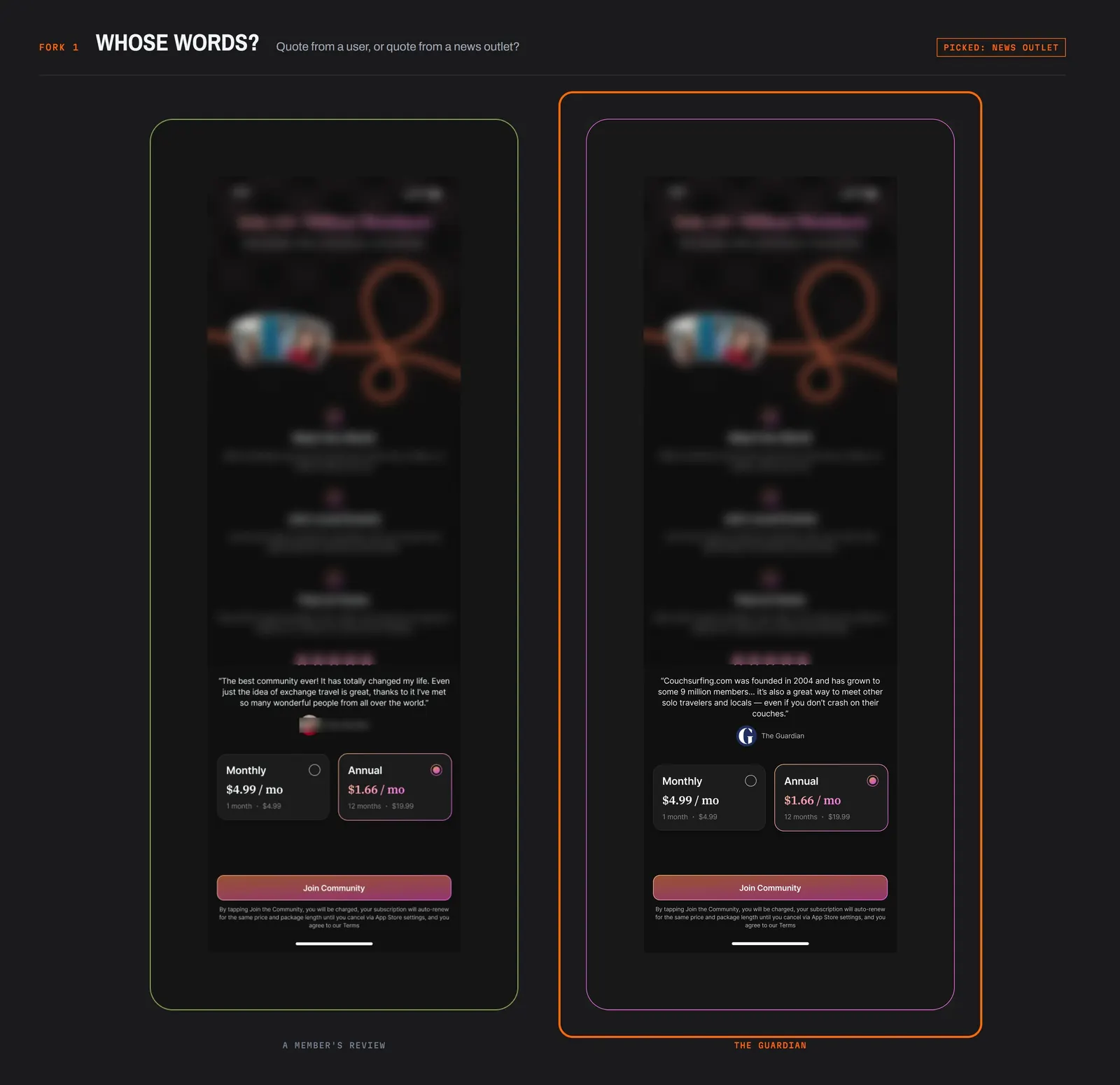
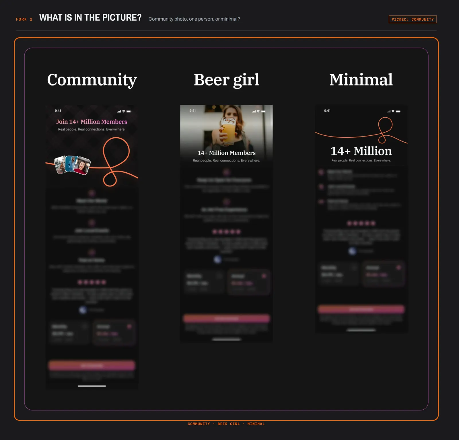
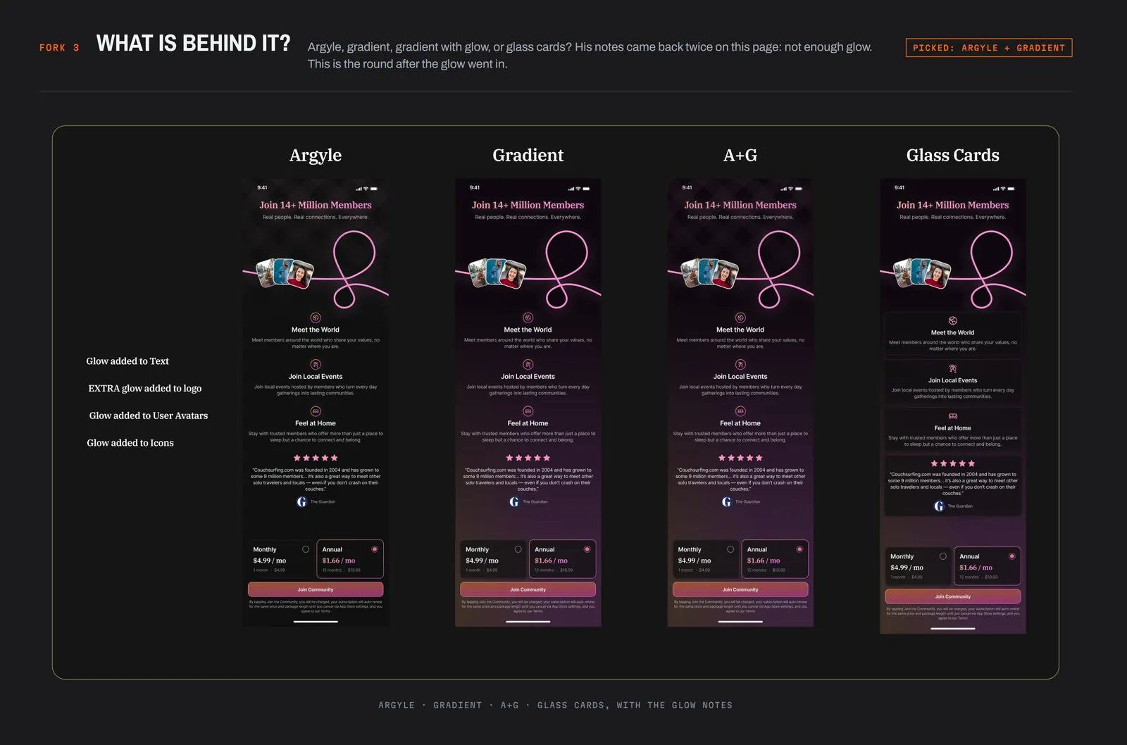
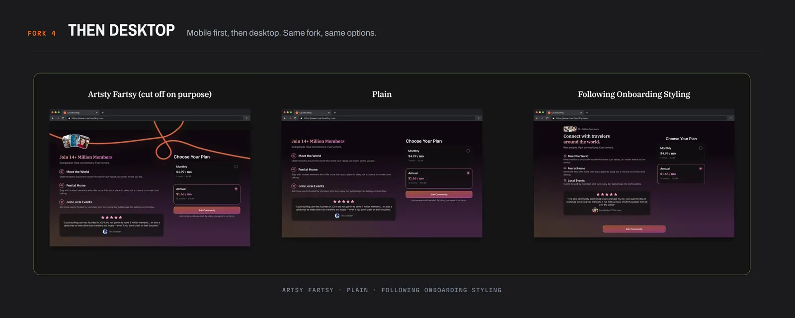
He got through it in one meeting. His notes came back specific, twice on the same page: not enough glow Brandon. Glow went in.
07What shipped
The paywall
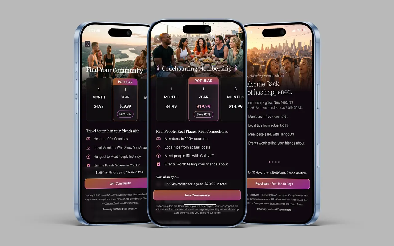
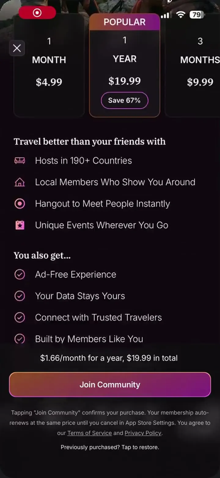
Recorded 2026-09-09. Three plans in a row, annual in the middle marked Popular with Save 67%, a three-month plan on the right. Under them, one line that changes with the selection, $1.66 a month for a year, $19.99 in total, so the per-month figure always has the full charge beside it. Scroll down for the perks and the press marquee.
The paywall
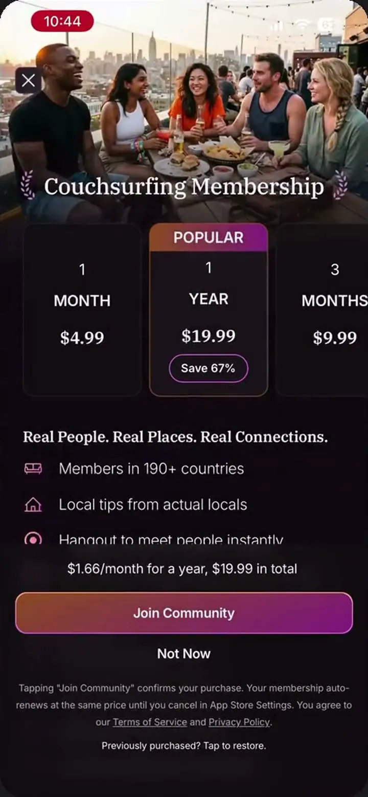
Recorded 2026-09-09. Three plans in a row, annual in the middle marked Popular with Save 67%, a three-month plan on the right. Under them, one line that changes with the selection, $1.66 a month for a year, $19.99 in total, so the per-month figure always has the full charge beside it. Scroll down for the perks and the press marquee.
Where membership is optional
The same paywall gets one extra link, Not Now, which drops the user into the free tier. That is the only difference between the two markets on this screen.
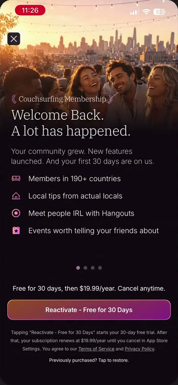
Welcome Back
Dormant users get a different offer: a month free, then the annual price, with the price and the length of the free month under every slide. Its own section is next.
I built the three-month plan as a decoy. The research on decoy pricing does not replicate well, so the third plan probably does not push anyone toward annual. It gives people who will not commit to a year somewhere to land, and it lets the annual sit as the default on its own. Popular is the only label on the screen, beside the annual default and the saving. It was set before any data came in, and it marks the plan the business wants chosen. Once live, monthly was the most-picked plan, so in hindsight the label should say Best Value. That is true of annual and it does the same job. It needs no explaining.
Most companies default to annual for what it does to lifetime value, and I researched that before choosing it
The annual default itself was deliberate and I would set it the same way again. Most companies default to annual for what it does to lifetime value, and I researched that before choosing it. A monthly default protects the person who did not mean to commit to a year and costs the business the longer customer. The business took the annual default with that risk in view. The perk list under the plans is sized to the screen. A short phone shows three lines, the rule from the research, and a taller one shows more so the screen is not half empty. The lines fill the height. They are not what sells it.
I wanted member quotes and did not have permission to use them
Three variants went live. A has the membership headline with the community photo, B is Find Your Community with laurels either side of it, over the same photo, and C is Join the Inner Circle with two plans stacked instead of three across. Same rules and a community photo on all three. A and B share the layout and the photo, so between them the bet was on the headline treatment, the words and the laurels together, and the result does not say which of the two did the work; C tests the headline and the layout together. The photo itself was tested on its own: several images ran, and the community ones did best, people together at a table with a view behind them. That photo is the social proof above the fold. People together is what the membership sells. I wanted member quotes and did not have permission to use them, and press quotes were never tested. They stayed a one-line marquee under the fold.
My pitch was a discount, 40% off
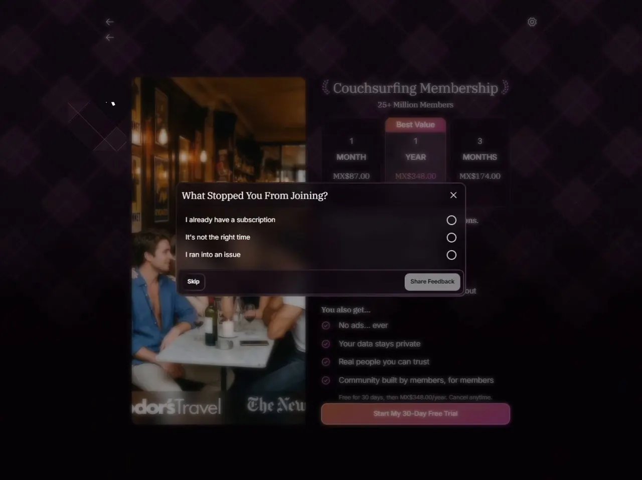
B converted highest, and Find Your Community is the one in the app today, in the recording above. The paywall is a hard one, meaning a member in a paid country cannot get past it into the app, and it only appears in onboarding. Freemium covers the countries where a hard paywall is not allowed. The first dismiss in a paid country also gets an exit offer. My pitch was a discount, 40% off. Seven days free won the room because the trial logic already existed from the dormant campaign, so it was the cheaper build. It had not been built when I left. The dormant and abandoned-cart campaigns are separate.
08Welcome Back
The offer for dormant users: welcome back, a lot has happened, a month free, then the annual price, with the price and the length of the free month under every slide and a reminder before the charge. That reminder is the line between this and the trial I cut. It goes out by email only, the channel least likely to reach someone who has stopped opening the app, so I argued for a second one inside the app, with the refund and ticket evidence behind it, and lost.
The call.
The trial was a stakeholder call, for the lapsed members the marketing team's campaign, which I helped build, had split into three cohorts. One was the people billing showed had paid once and churned. The other two were cut by time away alone, a year to three years, and three years or more, which reaches back past the original paywall of 2020 and the members who went quiet around it. The tooling could not say whether anyone in those two had ever paid, so I do not. Same offer for all three, a different angle and a different email for each.
My push.
A freemium test in the top paying countries instead. The feedback monitor I built, the one in the labs, read the stores, Reddit and the rest, and the pattern was plain: in a busy city nothing was wrong, and outside New York or Paris the platform read as dead, no host to find, nobody to host, a new feed with too few posts in it.
Price was not the main complaint outside the big cities.
More free members fixes that. The test would cover whole countries, big cities included, because free access for the small towns alone would not be right, and the top paying countries are where the thin regions sit and where there are the most members to test with.
The experiment was never drafted in full.
I laid out the pros and cons and asked for the go-ahead first. The go-ahead did not come, and the trial went ahead instead. The detailed plan lived in an internal document I no longer have access to. The exposure, the window and the stopping rule were mine to propose, and I never got to.
The test.
Given the call, I used the trial to test whether the lapsed segment responds to an offer of its own: one plan, and a message that knows who it is talking to instead of a paywall that does not. The same cohorts saw both, split half and half, against the three-plan paywall, and both arms carried the free month, so it is start against start. The three-plan arm was the same screen with the badge reading one month free.
The result.
The single offer had more trial starts and fewer cancellations during the trial than the three-plan offer. Both were read at trial start: I was laid off before the first charges landed, so whether the win survived day 30 is a number I never saw.
The two arms had the same audience and the same free month.
What differs is one plan against three, and a message written for the person reading it. Measured at trial start, and no further, the lapsed segment was worth its own offer. The read was at a 95% confidence level on a small cohort. The lift in trial starts was on iOS. On Android the two arms came out about the same, which surprised me.
One caveat went to the stakeholders with the result.
The three-plan arm was taking quarterly and monthly purchases as well as trials, and the single offer takes only a free month that rolls into annual, so at scale the single offer trades some near-term revenue for the longer plan. Since I left, from what I can see in the app, the free month has gone to every returning member, whatever their cohort. I do not know when that call was made.
09The impact
Under NDA
Conversion, revenue and cohort magnitudes for this paywall are under my confidentiality obligations and stay there. The three variants were tested against each other and B won. I can talk through the model, why it shipped, and what I would measure next.
The screens and the public plan pricing are above.
Corrections & caveats
- Variables
- The membership framing and the visual redesign landed together, so the two cannot be told apart in the result.
- Cohort
- Live from mid 2025. Read across the first months only.
- Confidence
- The paywall shipped and stayed. I can share the direction and nothing about the size.
- Not measured
- No control group for the reframe itself. The membership framing and the visual redesign landed together, so I cannot separate them.
- Welcome Back was read at trial start only; whether the win survived the first charge is a number I never saw.
- Confidential
- Magnitudes withheld. Direction stated.
10What I would measure next
- The reframe alonecopy onlyMembership language against subscription language, before the redesign lands on top. The one number I could not separate, and the one I most want.
- Quarterly renewalswho picks it, who staysWho picks it, and whether they renew.
- Welcome Back charge-throughtrial starts that became a first paymentThe single offer won at trial start and I left before day 30. This is the number that says whether the win was real.
- Support load after the chargetickets and refunds, 30 days onThe reminder went by email only. This is where the case for the in-app reminder I lost gets made or unmade.
Once it was live, monthly was the most-picked plan, and a lot more people than I expected picked the three-month plan I had built as the decoy. I had written that plan off as somewhere to land. People chose it. The industry benchmarks do not even report a three-month plan as a category, so I have a data point most paywalls never see. The other thing I would measure is who picks quarterly and whether they renew, because a plan that maps to a trip is a different product from a decoy.