ONBOARDING
REIMAGINED
When users don't know where to begin, they leave. Our challenge was to improve Scribe’s onboarding without rebuilding the tool. Through targeted design, user testing, and clear communication, we flattened the learning curve into a straight line.
PROJECT STATS
User Interview
Design Iterations
Insight-Driven Design
Insight-Driven
Design
User Interface Work
Onboarding Flow Architecture
Affected Users

THE PROBLEM
Scribe’s onboarding failed to clearly guide new users through basic actions like drawing walls or creating rooms. This led to high drop-off rates, as users felt confused, unsupported, and unsure how to get started.
THE PROBLEM
Scribe’s onboarding failed to clearly guide new users through basic actions like drawing walls or creating rooms. This led to high drop-off rates, as users felt confused, unsupported, and unsure how to get started.
THE PROBLEM
Scribe’s onboarding failed to clearly guide new users through basic actions like drawing walls or creating rooms. This led to high drop-off rates, as users felt confused, unsupported, and unsure how to get started.


broken
frustrating
overhwelming
too complicated
slow
unclear
Confusing
where to start

THE FINDINGS
User testing confirmed widespread confusion around key tasks. Participants struggled with unclear icons, missing instructions, and inconsistent visual cues—highlighting a critical need for better onboarding guidance and task clarity.
THE FINDINGS
User testing confirmed widespread confusion around key tasks. Participants struggled with unclear icons, missing instructions, and inconsistent visual cues—highlighting a critical need for better onboarding guidance and task clarity.
THE FINDINGS
User testing confirmed widespread confusion around key tasks. Participants struggled with unclear icons, missing instructions, and inconsistent visual cues—highlighting a critical need for better onboarding guidance and task clarity.

HOW MIGHT WE MAKE SCRIBE EASIER AND INTUITIVE?
THE GOAL
We converted our key usability challenges into opportunities for improvement in the onboarding experience.
THE GOAL
We converted our key usability challenges into opportunities for improvement in the onboarding experience.
THE GOAL
We converted our key usability challenges into opportunities for improvement in the onboarding experience.
UNCLEAR
>
GUIDED
The onboarding experience should walk users through basic tasks like “Draw a Wall” and “Create a Room” using visual cues and tutorials.
UNCLEAR
>
GUIDED
The onboarding experience should walk users through basic tasks like “Draw a Wall” and “Create a Room” using visual cues and tutorials.
UNCLEAR
>
GUIDED
The onboarding experience should walk users through basic tasks like “Draw a Wall” and “Create a Room” using visual cues and tutorials.
CLUTTERED
>
FOCUSED
To prevent overwhelm, the onboarding flow should surface only relevant tools and hide advanced features until needed. This allows users to focus on one task at a time.
CLUTTERED
>
FOCUSED
To prevent overwhelm, the onboarding flow should surface only relevant tools and hide advanced features until needed. This allows users to focus on one task at a time.
CLUTTERED
>
FOCUSED
To prevent overwhelm, the onboarding flow should surface only relevant tools and hide advanced features until needed. This allows users to focus on one task at a time.
GENERIC
>
PERSONAL
The onboarding tutorial should tailor itself based on a user's selected experience level. By offering profile-based onboarding flows.
GENERIC
>
PERSONAL
The onboarding tutorial should tailor itself based on a user's selected experience level. By offering profile-based onboarding flows.
GENERIC
>
PERSONAL
The onboarding tutorial should tailor itself based on a user's selected experience level. By offering profile-based onboarding flows.
STATIC
>
ENGAGING
The tutorial should include animation or short video clips to demonstrate actions in real time, helping users better understand interactions and retain information.
STATIC
>
ENGAGING
The tutorial should include animation or short video clips to demonstrate actions in real time, helping users better understand interactions and retain information.
STATIC
>
ENGAGING
The tutorial should include animation or short video clips to demonstrate actions in real time, helping users better understand interactions and retain information.
THE SOLUTION
GUIDED ONBOARDING
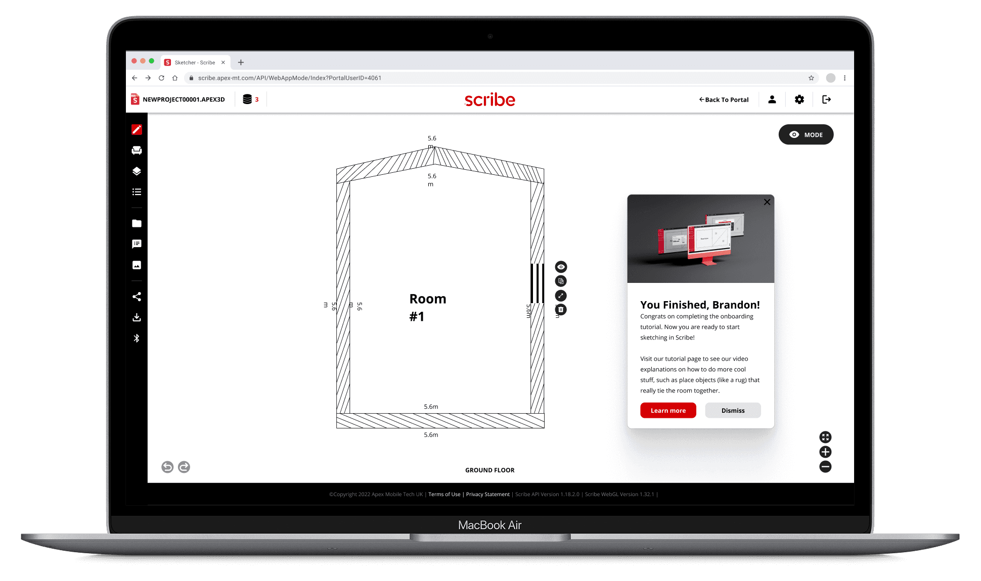
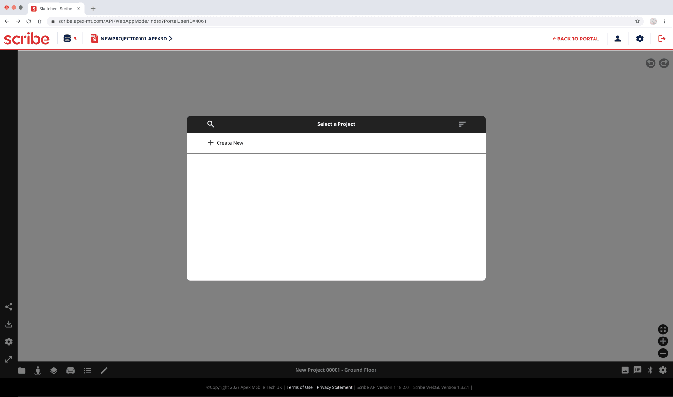
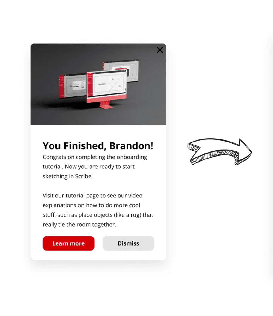
The redesign of Scribe’s onboarding experience introduced a contextual, task-based tutorial that guided users through core features like wall drawing and room creation. By tailoring flows to user experience levels and incorporating clearer visuals, we eliminated confusion and created a more intuitive, approachable entry point.
GUIDED ONBOARDING
The redesign of Scribe’s onboarding experience introduced a contextual, task-based tutorial that guided users through core features like wall drawing and room creation. By tailoring flows to user experience levels and incorporating clearer visuals, we eliminated confusion and created a more intuitive, approachable entry point.

Made sense
Easy to follow
I knew what to click
Simple steps
Wanted to explore more
too complicated
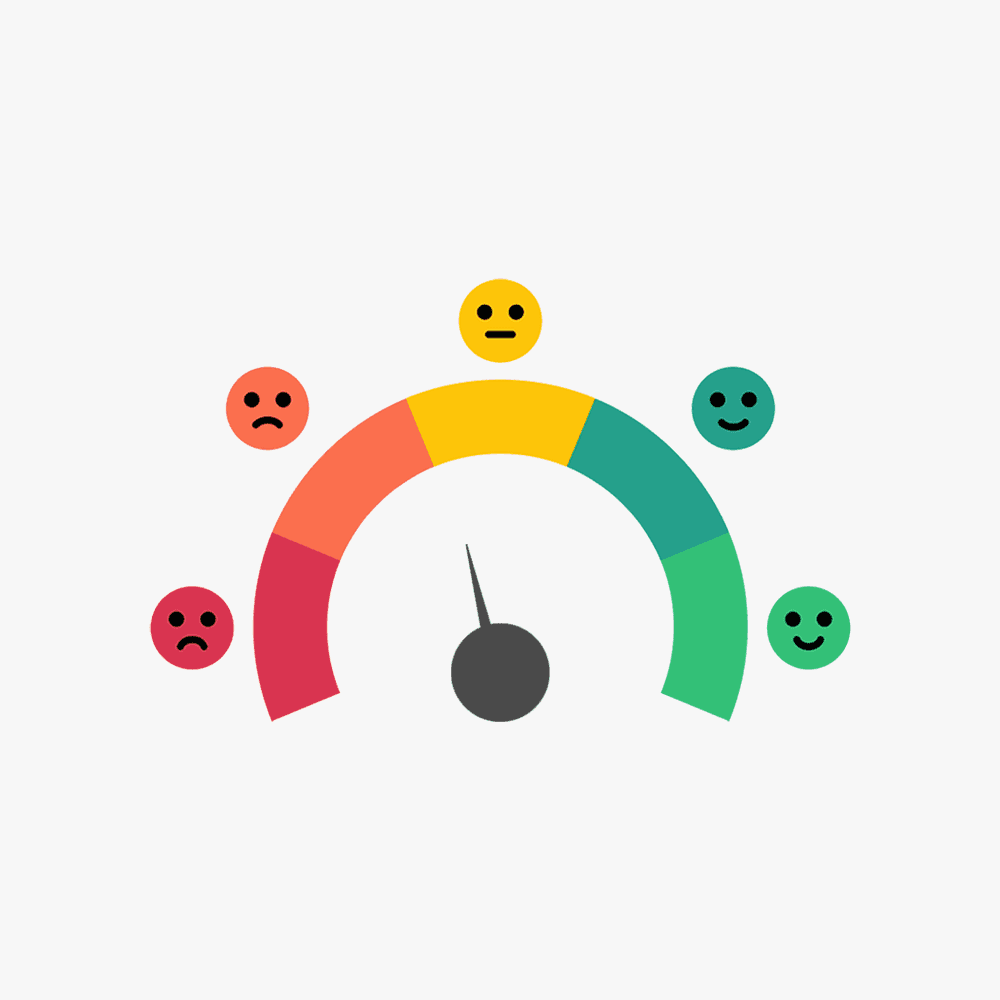
THE IMPACT
Title Card
Our revised onboarding experience led to a dramatic improvement in user understanding and task completion. After launching the high-fidelity prototype, 100% of test users successfully completed the primary tasks, and 4 out of 5 users described the tutorial as clear, helpful, and easy to follow. This shift laid the foundation for increased retention, lower support requests, and stronger user confidence across the platform.
THE TIMELINE
ALIGN

ALIGN
Defining the Problem
Validated user confusion through surveys and usability testing. High bounce rates tied directly to unclear onboarding and unfamiliar UI.
How We Identified the Problem
ALIGN
ALIGN
Defining the Problem
Validated user confusion through surveys and usability testing. High bounce rates tied directly to unclear onboarding and unfamiliar UI.
How We Identified the Problem
ALIGN
ALIGN
Defining the Problem
Validated user confusion through surveys and usability testing. High bounce rates tied directly to unclear onboarding and unfamiliar UI.
How We Identified the Problem
DESIGN
DESIGN
Prototyping Solutions
Created high-fidelity onboarding flows with clear instructions and visuals. Addressed key friction points like “Draw a Wall” and “Create a Room.”
Inside Our Design Decisions”
DESIGN
DESIGN
Prototyping Solutions
Created high-fidelity onboarding flows with clear instructions and visuals. Addressed key friction points like “Draw a Wall” and “Create a Room.”
Inside Our Design Decisions”
DESIGN
DESIGN
Prototyping Solutions
Created high-fidelity onboarding flows with clear instructions and visuals. Addressed key friction points like “Draw a Wall” and “Create a Room.”
Inside Our Design Decisions”
IMPACT
IMPACT
User Success & Client Value
4/5 users found onboarding helpful. Client praised research depth and plans to implement findings for future releases.
View Final Testing Results
IMPACT
IMPACT
User Success & Client Value
4/5 users found onboarding helpful. Client praised research depth and plans to implement findings for future releases.
View Final Testing Results
IMPACT
IMPACT
User Success & Client Value
4/5 users found onboarding helpful. Client praised research depth and plans to implement findings for future releases.
View Final Testing Results
Want to See More?
