Fullbay Connect
How do you turn a half-decade-old Integrations page into a scalable, subscription-tiered service?
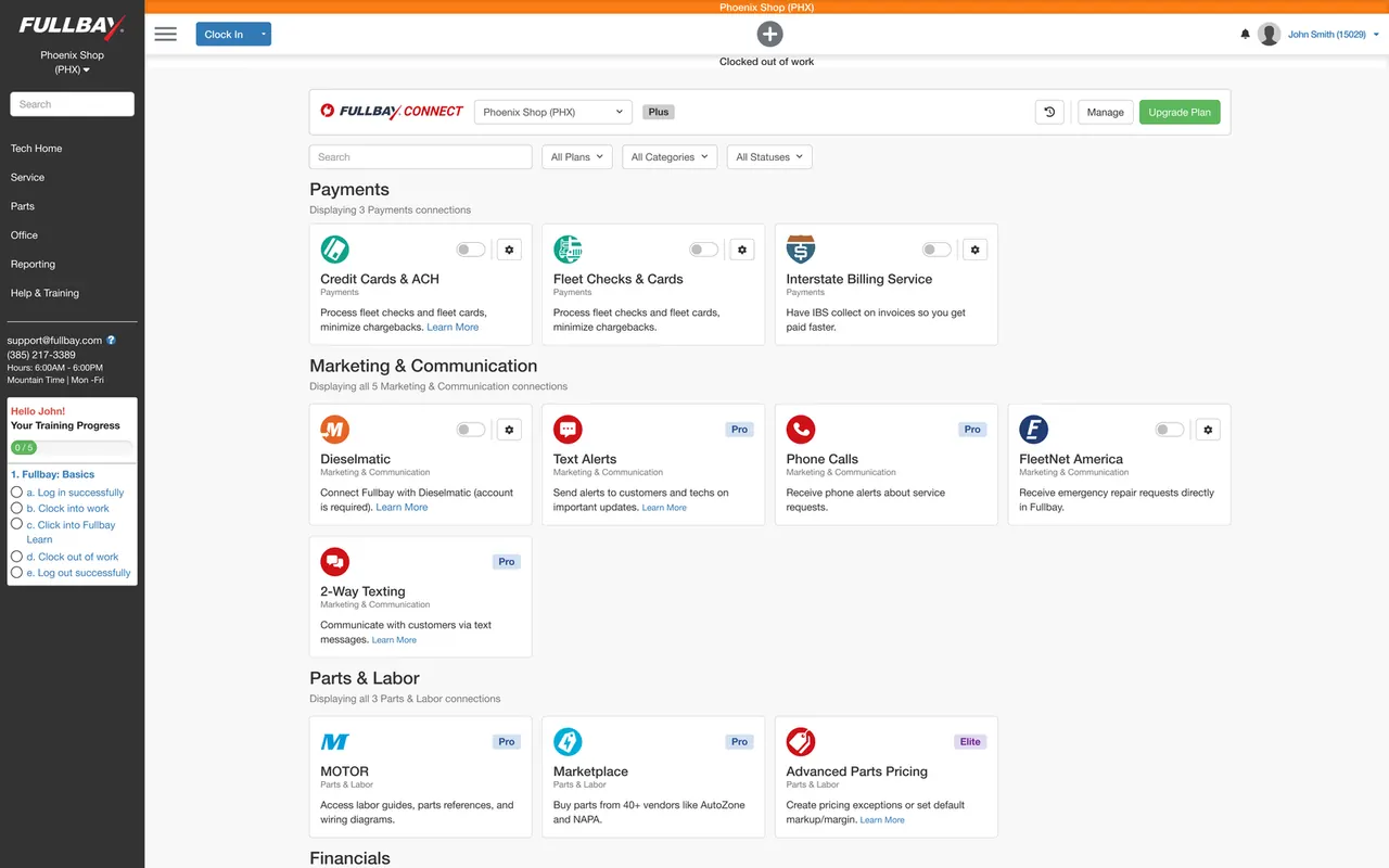
At a glance
- The problem
A five-year-old Integrations page with 2,000+ shops on it and a pile of new third-party connections coming that it could not absorb.
- What I did
Rebuilt it on the components the rest of the app already used and collapsed several branded buckets into one tiering model, with plan state and the upgrade path on the page.
- What happened
$1.1M in revenue growth attributed to the launch by the company. No holdout group. The size is the company's number and the direction is what the design can point to.
01Scope
2,000+
shops the page had to serve
3
problems reframed into design goals
1
legacy page rebuilt from the ground up
02The challenge
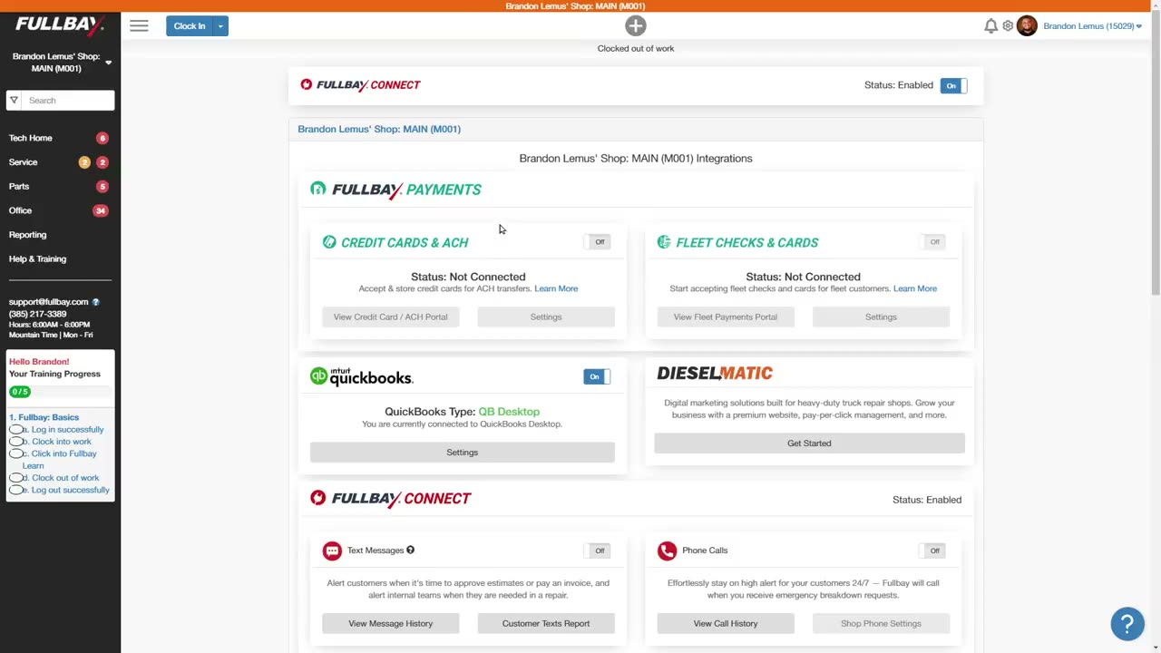
The Integrations page was five years old and visually inconsistent, and it was straining under the 2,000+ shops it served. It also had to absorb far more third-party connections in the near future without collapsing again.
This was a UI and monetization project. The research was competitive analysis, because there was no budget for more.
03The goal
How might we make integrations simple and modern?
Rebuild on the Bootstrap 5.3 components already in use across the non-legacy parts of the app, rather than maintaining a second visual language.
Make the key features findable and retire the underperformers. Show each shop only what applies to it.
The page had marketing language and several Fullbay-branded buckets doing duty as price brackets. Collapsing those into one coherent tiering model was the design problem.
04The solution
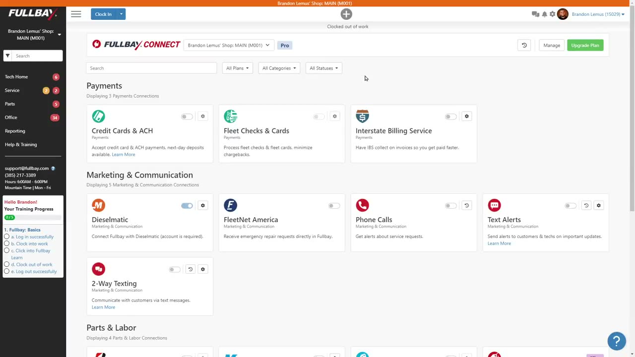
Fullbay Connect
One page, grouped by what a shop is actually trying to do: payments, marketing and communication, parts and labor. Plan state, entitlement and upgrade path are in the same view.


05What I dropped
A second visual language, a fresh system just for this pagethe non-legacy parts of the app already ran on Bootstrap 5.3. Rebuild on that.The Fullbay-branded buckets doing duty as price bracketsnone of them fit the tiering model. They were marketing copy.
06The impact
Corrections & caveats
- Variables
- Design was not the only thing that changed.
- Cohort
- Post-launch. The revenue figure is the company's, reported against the launch rather than against a held-back control group.
- Confidence
- I can point to the direction and not the size. This shipped as a redesign and a new subscription tiering model at the same time, so the offer changed alongside the interface. The $1.1M is not the design's alone.
- Not measured
- No holdout group, so there is no counterfactual to compare against
- How much of the lift is new tier adoption versus existing shops upgrading
- Longer-term retention on the new tiers
The page had been a five-year-old liability nobody wanted to touch. After the launch the business could keep adding to it, and the tiering worked as one model instead of several competing ones.
07What I would measure next
- Holdoutvs. controlThis launch had no counterfactual. Hold back a slice of shops so the lift has one.
- New-tier adoption% of upgradesSplit from existing shops moving up. The number I could not separate.