Add a Fee
Should you change a workflow everyone has already adopted, for the better?
At a glance
- The problem
Adding an automated card fee was a dense one-page form. Veterans tolerated it, newcomers got it wrong, and the company had never run a usability test to prove either.
- What I did
Argued for the research and tested a stepped modal against the long form with eight people. Shipped the stepped one inside the Bootstrap patterns the team already knew.
- What happened
47,517 transactions and $1.4M in fees through the shipped flow. These are throughput numbers. There was no before-state and no control, so none of it is lift.
01Scope
Fees collected through the flow
Throughput
A new capability with no baseline to beat. The $1.4M moved through a flow I designed. It is not money the design created.
13
design iterations, give or take
2
versions tested head to head
412
shops using it
02The problem
Shops wanted to automate credit card fees. A flat amount or a percentage, applied per shop or per customer. Fullbay had no native support, so people were doing it by hand. Manual workarounds led to errors and support tickets.
It had to work for veterans and for newcomers. The business case was smoother payment operations with no loss of compliance or trust.
03The two real constraints
- 01The dev team had little experience beyond Bootstrap, so the UI had to stay technically simple and cheap to implement.
- 02Formal user testing did not exist at Fullbay yet. I had to argue for the research before I could run it, so stakeholder education was part of the design problem.
04The goal
How might we make adding a fee easier?
Simplify the language and add an inline disclaimer that clarifies and does not advise. It stayed inside compliance.
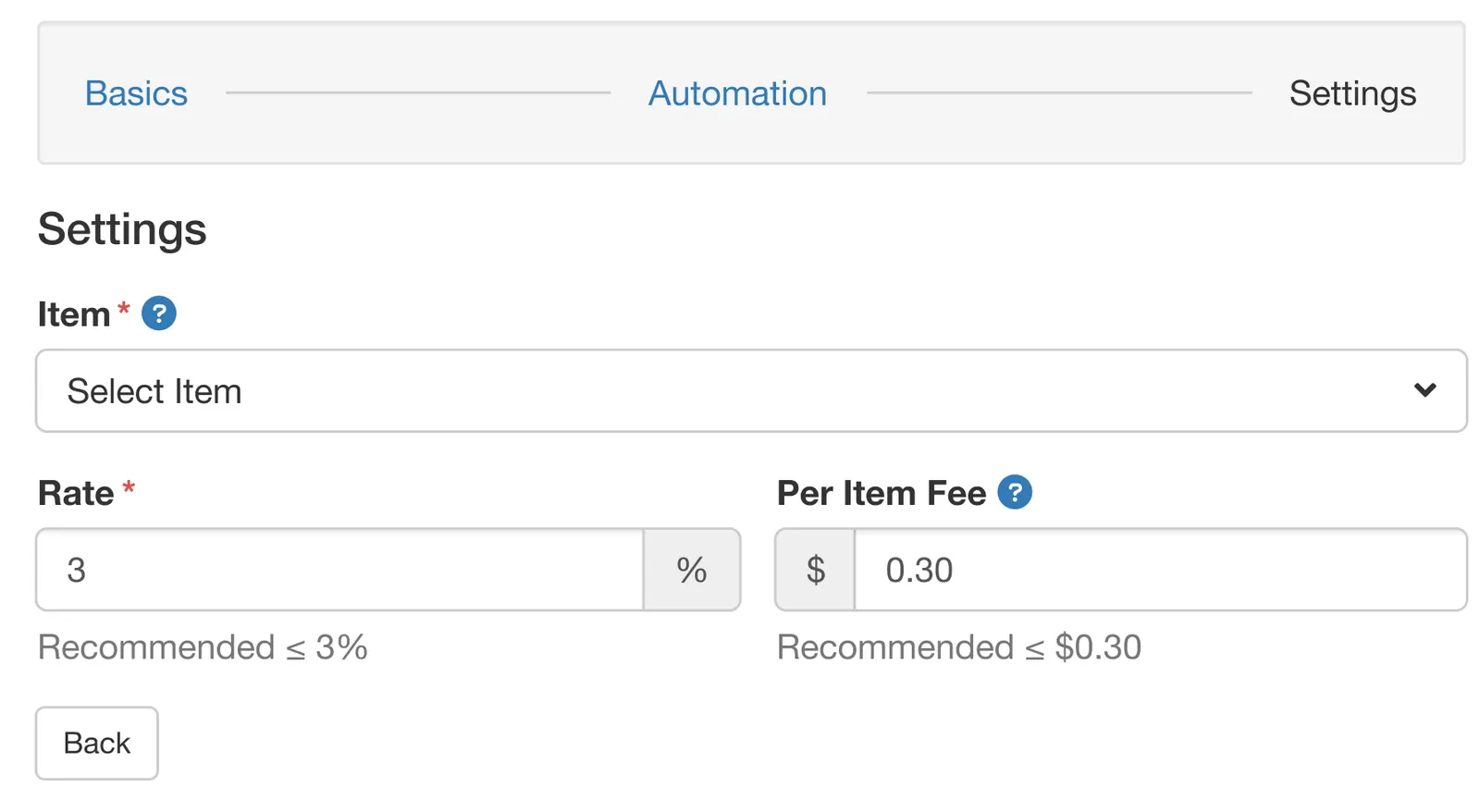
Move from a dense one-page form to a stepped modal, so the load is progressive and setup finishes without errors.
Work inside Bootstrap and the native form patterns instead of handing the team new tooling. Keep the usability gain.
Flat or percentage, by shop, by entity, each choice labelled, with a preview summary before confirmation, so mistakes get caught there.
05The test
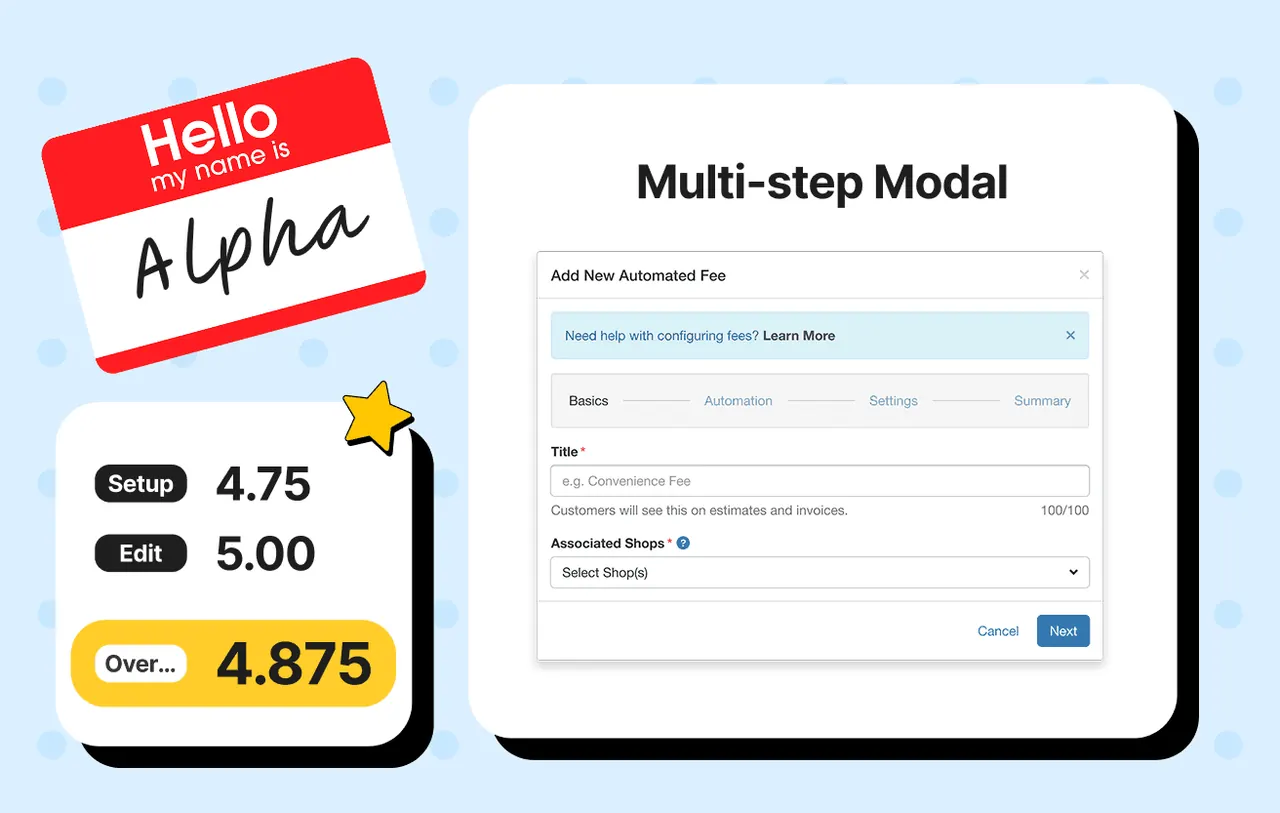
Two builds, tested head to head. Alpha was a multi-step modal with progressive disclosure. Bravo was a traditional long-form modal, consistent with the UI Fullbay already had. The aim was to challenge the default without alienating the people attached to it, so stakeholders saw previews and walkthroughs early.
Eight participants in two groups, one group per build, matched as evenly as I could with a first-time user in each, so nobody used both and order did not need balancing. Each rated their build per task on a five-point scale and gave open-ended feedback. The test was checking whether the tasks weighed the way we assumed, on a feature so ingrained in how a shop builds an invoice that clarity mattered more than polish.
Alpha and Bravo, rated per task on a five-point scalen = 8

Both scored identically on editing an existing fee. The gap is in setup, first time through, when nobody knows what the fields mean yet. Progressive disclosure is for that moment. Alpha shipped.
Editing was the task the shops already did every day in a very full program, so both builds had to be at least that clear, and they were. The means are exact arithmetic on four ratings each, so the third decimal in the table carries nothing.
That was not a foregone conclusion. Stakeholders were still uneasy about moving to a new pattern well into the final presentation. The scores moved them where the mockups had not.
06What I dropped
Bravo, the long-form modal: everything on one screen, the way the team already workedit tied Alpha on editing and lost on setup, and setup is what matters first time through.
07The impact
Corrections & caveats
- Variables
- A new capability, so there is no earlier flow to compare against: the design is the whole change.
- Cohort
- Post-launch usage, measured on the shipped feature and reported at a company all-hands. The period the figures cover I do not have any more.
- Confidence
- High on adoption, and silent on lift. These are throughput numbers. The capability did not exist before, so there is no baseline I could have beaten and no conversion improvement to claim. The $1.4M moved through a flow I designed. It is not money the design created.
- Not measured
- No before-state to compare against, because there was no before
- How much of the adoption is the design versus the feature existing
- Whether support tickets about manual fee workarounds actually fell. I never got that number
The result I am most pleased with is not on that list. This project introduced the company's first formal user testing process, and the stakeholders most resistant to the wizard became its advocates once they watched people use both versions. That changed how the next decision got made, and it is still how decisions get made there, from what the PMs I keep in touch with tell me.
08What I would measure next
- Support ticketsmanual fee workaroundsThe number that says whether the flow removed the problem or relocated it. I never got it.
- Before-statea week of the old formUnder the same instrumentation, before the new one ships.