Key Moments in
The Design Process
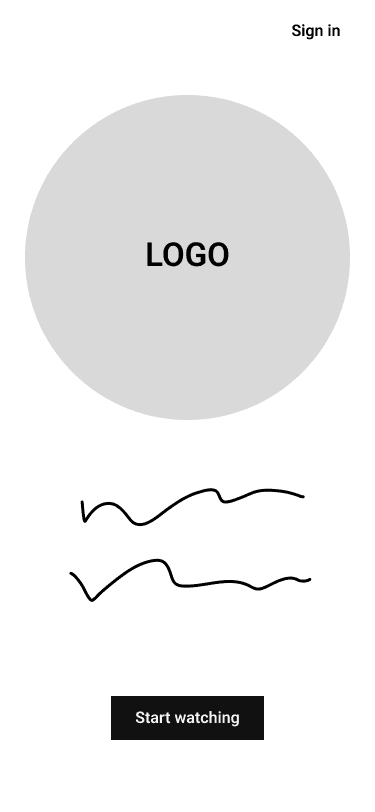
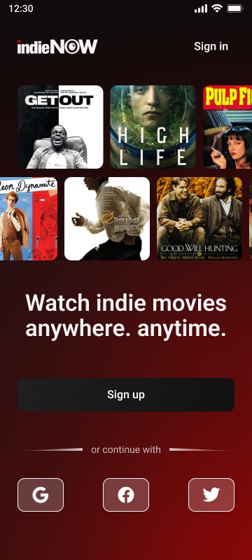
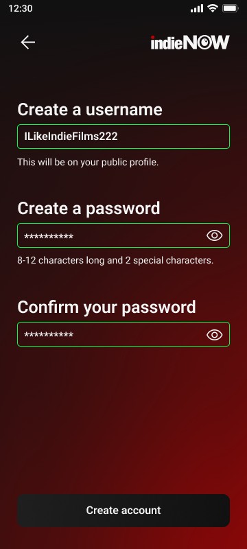

Splash Screen
Unique but Familiar
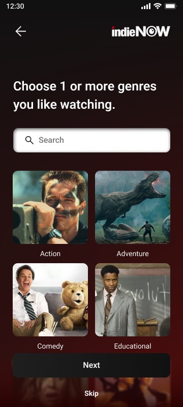
I wanted the app's splash screen and onboarding to capture the attention of our new and existing users. These apps are used by 18-25-year-olds, which is a market that we want to appeal to. I needed to create a bold, hip, and smart feel for indieNOW.
The Research
Secondary
Research Studies
The big question at the beginning of our research was “What do users value from their visit?” In our initial process, I thought that being able to read plaques and see animals was a sufficient visit. In a closely related research study on this topic, it was shown that out of 500 people, only 16 families with children under 18 read plaques. This threw me for a loop as I knew plaques were some of the easiest ways to get information out to the public and without them there would be a heavy emphasis on the keepers and tours. I began gathering surveys and user interviews to confirm if this particular study was true and if so, we would need to pivot our focus.


Home Screen
Where will users upgrade?
Home Screen
Where will
users upgrade?
One of the most important considerations when designing was how to make it easy for existing users to upgrade. I had this question constantly as I began designing, and I struggled with how to integrate something without over cluttering their devices. Settings would be a way to upgrade as well as during the playback of a movie, but I wanted to make it even easier on users.
I ended up creating a simple and elegant FREE tag next to the user’s icons to make that upgrade seamless, easy, and fast. During user testing, the most used path to upgrading accounts was via this new FREE tag and users really reacted positively to it.
One of the most important considerations when designing was how to make it easy for existing users to upgrade. I had this question constantly as I began designing, and I struggled with how to integrate something without over cluttering their devices. Settings would be a way to upgrade as well as during the playback of a movie, but I wanted to make it even easier on users.
I ended up creating a simple and elegant FREE tag next to the user’s icons to make that upgrade seamless, easy, and fast. During user testing, the most used path to upgrading accounts was via this new FREE tag and users really reacted positively.


Friends
Recommendations
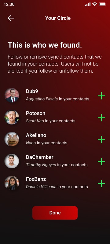
I found that users did not want to sync their phones to an app when adding friends. They liked the feature but didn't want to be forced to use it. I ended up taking inspiration from Spotify and how they integrated their community feature as more of a secondary feature that is discovered while using the app. I took that same approach and applied it to my design.
The feedback gained from this was immensely better and users started to love that this feature even existed, so much so that they want more to it. This would be something we could look into on the next release of the app.