Couchsurfing Tours
How do you show members where the features went, without a tutorial they will skip?
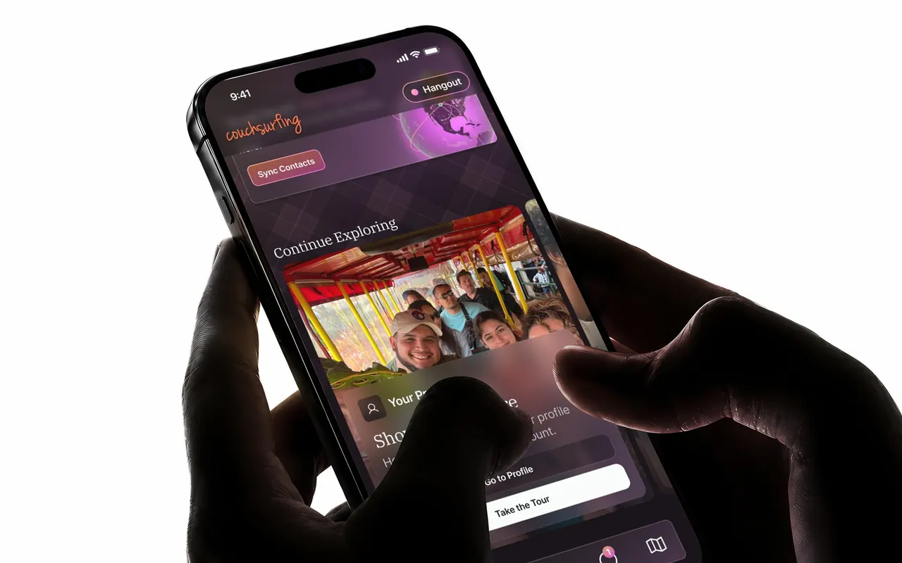
At a glance
- The problem
After the redesign, members who had used the app for years thought features were gone when they had been moved or renamed. Support tickets said so, and so did my own monitor reading Reddit. The ask from product was a way to teach features. The first idea was more upsell-style cards.
- What I did
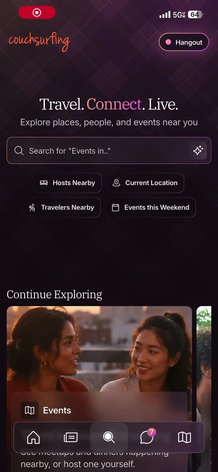
Designed a spotlight tour system, proved it in Braze, found that Braze cannot reach a widget inside a Flutter app, and built it natively with an AI pair writing the Flutter under my direction: a carousel of tour cards on Explore, an overlay that dims the screen and cuts a ring around the real control, and a coach mark that follows the member into whatever they open. Four days and 49 commits in one pull request.
- What happened
It merged under my name after an engineer revised the architecture to close the mobile lead's review, and it is live in the app. I left before it could be measured. This page has what shipped and what the device and the review taught me, and no result.
01Scope
49
commits in four days, under my name
59
files across seven packages of the production app
5,500
lines of Flutter, give or take, and 13 test files
02The problem
The redesign moved things. Members who had used Couchsurfing for years opened the new app and could not find their trips, the filters that find the right host, or events, which used to be called something else. Support tickets said it. My own feedback monitor, SEN-MO (opens in a new tab), the bot that reads Reddit and the app stores every morning, said it more often than anything else about the redesign. The pattern was the same each time. A feature was assumed missing when it had been moved or renamed.
Some of the complaints were right. Before my time, a few features had been removed as a decision, and no tour brings those back. The brief underneath was narrower: show the features that still exist, and be ready to show new ones as they ship.
The loudest complaint of all was the recently-active filter not being on by default, and members not knowing how to turn it on. I proposed changing the default several times, with the tickets and the monitor's numbers behind it, and lost every time. It was never in my power. The stakeholders were set against it, and I never got a reason I could take back to the evidence. The tour is what I could ship. The default is still the fix.
My VP of Product put it as a need to help new users learn our features, and the first thought on the table was more cards in the upsell style the app already used. I took the ask and spun it a different way, borrowing the walkthrough games run before they let you play, with one change for people like me who skip every tutorial: a second button on every card that takes you straight to the feature instead of walking you there. It shipped on iOS. The Android build and the desktop site show one button, and I do not know why, and I wish I did. The design had it on all three, and I built it on an Android emulator and a Pixel, so it was there when I left. Probably timing: the layoffs took the people who would have QA'd the Android and web builds, and the button went missing without anyone to catch it.
A tour patches an information-architecture problem. The redesign was not going to be redone, a tour ships in days, and a card carousel on Explore is a place to add every feature we release after this one. The findings that mattered came from the tickets and the monitor before any tour existed, and they are why the tours exist. Results from the tours themselves did not exist yet when I left. There was no single owner of the navigation to take them to, which is part of how the problem got a tour and not a fix.
03What I dropped
Braze first, then what the device changed.
Delivering the tours through Braze, so copy and targeting could change without a releaseBraze cannot see a Flutter widget.I built it there first: a tour anchored to page elements in plain HTML and CSS, to prove it needed no developer time. It worked on the web. Then Flutter, which paints its own widgets, and Braze cannot read them. The mechanism has to be native, and once it ships in a release a Braze payload only buys copy edits, at the price of a broken tour being a campaign nobody can debug from inside the app. So I built it myself, with an AI pair writing the Flutter. Engineers hate building tours, and I had a picture of the animation and no idea what the code could do with it, so the fastest way to find out was to build it and see it on a phone.
Parking a lost tour instead of ending it, with a bar offering Resume or DismissRestarting costs less than resuming.I built it, ran it and reverted it the same day. Resuming from wherever a member wandered off to means navigating back from an unbounded set of places. A restart from the card is cheaper on tours this short, and the better fix was to stop accidental exits: a shake and a glow when a tap lands outside the target.
04The five tours
I chose the tours from the most repeated claims in the tickets and the monitor, which were also the core of the product.
- 01Profile. Where your profile lives now, what it looks like, and where to edit it. I forgot how to reach it myself more than once, and I did not design that screen.
- 02Hangout. Going live, and seeing who else is. The tour walks the go-live drawer: what you are up for, then a detail and where. It points at the switch without pressing it, because going live is a real state change and stays the member's call. Mobile only, since the feature does not exist on desktop.
- 03Trips. What a trip is and how to make one, because a trip has to exist before a stay request can be sent. The tour goes through the library to Your Trips, then to New Trip.
- 04Hosts. Where to find hosts, and where the filters live that turn a wall of results into people who can actually take you. The loudest complaint of all was the recently-active filter not being on by default, and members not knowing how to turn it on. The tour walks the three trust filters under one spotlight and ends on Apply.
- 05Events. A feature people thought was missing, under an old name. Members were seeing curated events instead of member events, so the tour points at the filters. This tour was born on desktop, where Hangouts does not exist, and was added to mobile after.
The cards carry the app's illustrated style, with one exception. The Profile card shows the member's own photo, because the tour is about them.
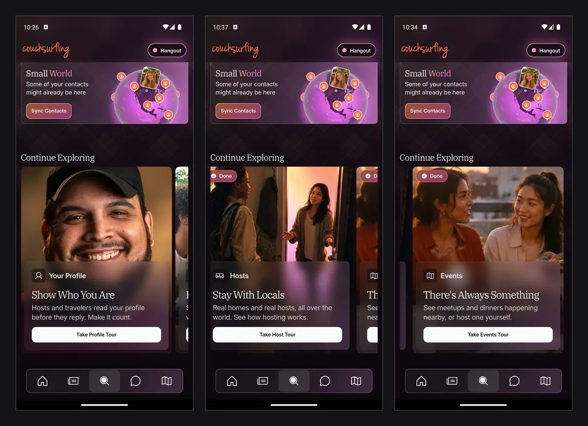
05The lock on the Hosts card
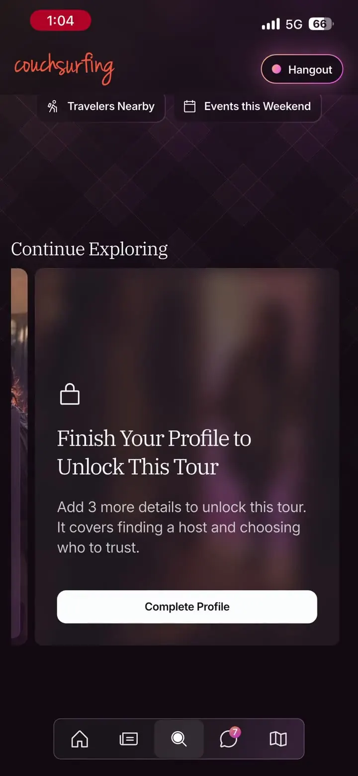
The Hosts tour ends inside host search, which sits behind a minimum-complete profile. On a fresh account the tour walked the member straight past that gate, pushed host search over the Add to Profile sheet the app had just opened, and left that sheet stranded underneath. I found it on a test account whose profile was barely started.
It frosts, the two actions become one Complete Profile button into the sheet the app would have opened anyway, and the count in the copy comes from the same source the sheet reads, so the ask cannot change between the card and the next screen. Locked cards sort behind the ones you can act on and ahead of the ones you have finished, because a locked tour is still to do and a done one is finished.
The lock checks the loading state as well as the completeness flag, because the flag reads true while the checklist is still loading on a cold start. Without that the card rendered unlocked and then dropped a lock onto it, and it had been invisible in testing because the first run after launch sails through. And the tap re-checks before it starts anything, so a tap that lands in the gap between launch and the checklist's answer cannot start a tour the card would refuse a moment later.
This is the card on a test account three details short of the minimum. It says what it needs before the tap, and the button opens the same sheet the app would have opened anyway.
06What the device taught me
The spotlight worked on the first day. On the second, on a real phone against real layouts, three of the four tours then on mobile died. Each ended cleanly through the timeout I had built for a target that never appears, which paid for the safety net on its first outing. Each death had the same cause. The target existed in the widget tree and was not on screen. Fourteen discoveries follow, in the order I hit them, one card each. My commit subjects are the headings.
07The design before the code
I drew in code first. The Braze proof of concept was the sketch: anchoring came before anything else, then the coach mark, then the transitions. The Figma file came after the mechanism worked, and it holds every card state, including the locked Hosts card and a Hangout card for a member who is already live. Those frames stay in the file.
What changed once it ran on a real device is the section above. The design assumed a target was either there or not. The phone knew four ways a target could be missing: off screen, inside something still animating open, mounted under another route, or on a screen that had not loaded yet. Each got its own rule, and each is a card above.
The thing I fought longest was animation
The thing I fought longest was animation. Flutter in debug mode renders motion roughly, so the transitions looked worse on my phone than they would ever look for a member, and I had to judge smoothness through that. Once the peek-then-point transition looked right in debug I knew it would look better than right in a release build.
I did not write the Flutter by hand. I know code, and Flutter was a new language to me, so the details were not hard to follow, but an AI pair wrote the code, and I directed it, tested it and debugged it with the pair on a real phone. I am not a Flutter developer. Every decision in the build was mine, made against the device, and the review that follows treated the result as engineering.
08The review, and the second pair of hands
Before I opened the pull request I had a bot read the repository's recent pull requests, the ones that passed and the ones that failed, and write down why they failed. Most of it was mechanical: an analyzer that fails on a warning, generated files that must be regenerated and formatted, a coverage floor on new code, a custom lint package with rules about casts and records and where a bloc may be provided. I ran every check locally before anyone else saw the branch, and the last commits on the branch are that sweep.
the engineers were short of work that week, so I asked a frontend engineer to make the revision pass
The pull request drew sixteen inline comments and a changes-requested from the mobile lead. They were about where things go: decisions in the bloc and not in a widget, no user-facing copy in a layer that cannot see the screen, value types in the domain package with the other enums. I understood what was being asked. I did not have the time to go back and do it myself, and the engineers were short of work that week, so I asked a frontend engineer to make the revision pass. It merged under my name with his architecture changes in it. The tours, the screens, the flow, the copy and the behaviour are mine, and the 49 commits are the work. The layering is his: decisions into the bloc, copy out of the wrong layer, value types into the domain package, one pull request split into several, and the components into Widgetbook, the app's component library, which I had left alone on purpose because I did not know that stack well enough yet. The same tours, better placed in the app.
that engineer spent his time on edge cases, and found ones I had not
It was the better call, for a reason I had not planned on. With the structure handled, that engineer spent his time on edge cases, and found ones I had not: what happens when a step's real control asks for location permission, a Braze modal colliding with host search mid-tour, and a member who is already live in a hangout when the Hangout tour starts. The Events tour today walks straight into the location prompt and comes out the other side. The Braze collision we fixed on mobile before launch. From what I can see in the app since I left, it has regressed: the member sees the tour prompt first and the Braze modal after it, the opposite of the intent, and it would have been a QA item the same week if I had been there. The Hangout case I cannot see from outside and will not guess at.
a tour can collide with the app's own logic in more places than a modal can
Adding a tour now is small. The components live in Widgetbook, so a new tour is a new entry, not a new build. The edge cases are what cost, because a tour can collide with the app's own logic in more places than a modal can, and each one has to be tested on a device. That is also why native was the right call. Braze proved the idea, and the app had to own the behaviour.
Brandon had designed a multi-step user's tour through our large app, then he took the initiative to implement it within our codebase! It was really impressive how fast he was able to pick up a foreign codebase and build out a non-trivial task of focusing elements and stepping through the app.
09Instrumentation
The tracking plan is the closest thing this page has to a results section, so here are the questions it asks. Every card tap reports the card and the slot it was in, because finished cards sink to the end of the row between launches and a first-slot tap is not comparable to a last-slot one. Every entry and exit of a tour reports through one listener rather than from each button, so Back, Skip, Next, tapping the spotlighted control and finishing the last step all land in the same funnel. A skip carries the step it was standing on. Declined outside taps report on their own: the tour carries on, but a step collecting those is a step whose coach mark is not landing. A lost target reports too, because a wrong target and a member wandering off look identical from inside the tour and only the volume tells them apart. Abandoning the app mid-step fires nothing, so that is started minus finished and skipped in the analysis.
The age split lives in cohorts built in the analytics tool, so completion and declined taps can be read against them without a property on every event
I tracked more than I needed, because I would rather have data I never use. The two things I most wanted to know were whether more people would press the direct button than take the tour, which I expected, and whether the people who chose the tour skewed older, which I suspected. The first can only be read on iOS now: that build carries both buttons, and the Android build and the desktop site carry one. The age split lives in cohorts built in the analytics tool, so completion and declined taps can be read against them without a property on every event. The plan was to read that at thirty days live. I left before the thirty days were up, so neither question has an answer yet.
10What shipped

11The tours, running
The five tours, recorded from the live app on an iPhone in September 2026. Step through them with the arrows, or a swipe on a phone. On a desktop the tour in view plays on its own. On a phone, tap the one you want.
Profile
Three ask for the real tap. One is look-only with Next. The last tap opens Edit Profile and ends the tour there. On iOS the card carries both buttons: Go to Profile, and Take the Tour.
- 01Your LibraryEverything of yours lives behind here: your profile, your settings, all of it.
- 02Your ProfileTap your profile icon any time to view and edit your profile.
- 03Your Home DetailsYour place, as guests see it. Update it any time with Edit Home.
- 04Keep It Up to DatePhotos, story, home: the page behind this button is yours to shape. Tap it and make it feel like you.
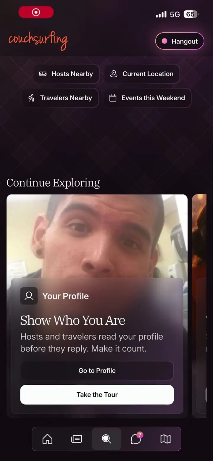
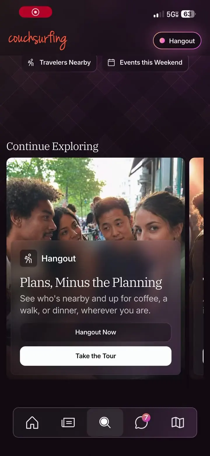
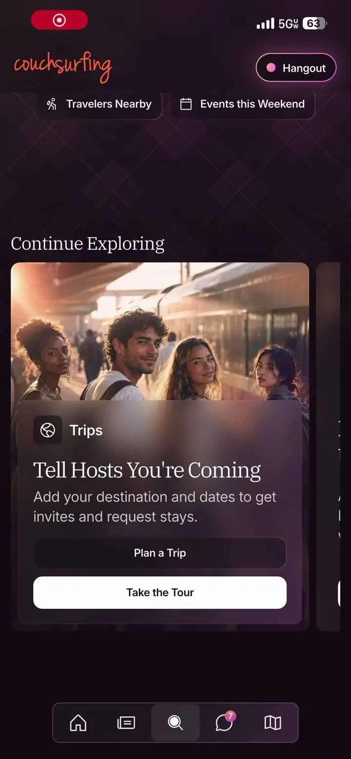
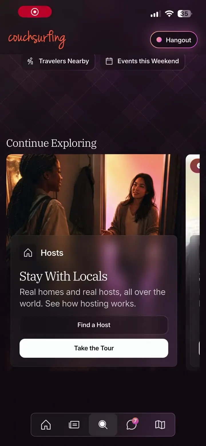
Profile
Three ask for the real tap. One is look-only with Next. The last tap opens Edit Profile and ends the tour there. On iOS the card carries both buttons: Go to Profile, and Take the Tour.
- 01Your LibraryEverything of yours lives behind here: your profile, your settings, all of it.
- 02Your ProfileTap your profile icon any time to view and edit your profile.
- 03Your Home DetailsYour place, as guests see it. Update it any time with Edit Home.
- 04Keep It Up to DatePhotos, story, home: the page behind this button is yours to shape. Tap it and make it feel like you.
Hangout
With location off it walks the member through the permission first, then the go-live drawer, and it points at the switch without pressing it, because going live is the member's call.
- 01Tell People You Are AroundGoing live puts you on the map for travelers and locals nearby who are up for meeting today.
- 02What Are You Up For?Pick the kind of thing you fancy, or Up for Anything. It is how people nearby decide whether to come and find you.
- 03Say More, If You Want ToA detail and a place, if you want them. Tapping either finishes the tour and hands the drawer back.
Trips
At the second step nothing scrolls, and the ring sits flush above the tab bar.
- 01Your LibraryEverything of yours lives behind here, trips included.
- 02Your TripsYour next few sit here. A trip is a destination and some dates, and that is all it takes for hosts there to know you are coming.
- 03See Them AllOpens the full list, where you add and edit them.
- 04Add Where You Are GoingDestination and dates, and hosts there can find and invite you.
Hosts
The search field is the look-only step, pointed at and never pressed. The results area shows a loading spinner for about a second, then the first result loads behind the dimmed screen.
- 01Hosts Near YouOne tap for hosts around you right now.
- 02Anywhere, Not Just HereIt opened on hosts near you, but type any city here and it searches there instead.
- 03Now Narrow It DownFilters are how a wall of results becomes people who can actually take you: when you are going, how many of you, what kind of space, and who they are.
- 04Who You Can TrustTurn these on when you are deciding who to ask. They cut the list to members who will see your message and who others have actually met.
- 05Then ApplySet what matters to you and the list rebuilds around it. Change your mind any time. Filters are not a commitment.
Events
With location off it walks into the permission, which the engineer's revision added, and picks up on the other side.
- 01What Is HappeningMeetups, dinners, and whatever else people are putting on near you. It lives down here.
- 02Narrow It DownChange the city, the dates, the type or the cost. A long list becomes the two or three you would actually turn up to.
- 03Host Your OwnAnyone can put an event on the map. A place and a time is all it takes, and people nearby can join.
12The impact
It is live. Open the app, scroll Explore to Continue Exploring, and the five tours are there, dimming the screen and cutting a ring around the real control. It merged a few weeks after the pull request opened and reached members after my last day. I saw it in production for the first time on 11 September 2026, through an emulator, while writing this page.
The review is the other thing I took from it. A mobile lead reading the pull request as engineering, and not as a designer's experiment, produced sixteen structural comments. The revision that closed them is on the page above, with the engineer's edge cases beside mine.
Nothing measured
There is no number here. None exists yet. The tracking plan is in place and the funnel was reporting to the analytics stack when I left, and I left before anyone could read it. I will not guess at a completion rate or borrow a benchmark. The source belongs to the company and stays out. The architecture is described in prose.
The design, the shipped screens, the edge cases, the tracking plan, and what I would read first.
Corrections & caveats
- Cohort
- Live in the app since August 2026. Five tours on Explore, four on desktop.
- Confidence
- Shipped and running. Nothing measured by me.
- Not measured
- The direct-to-feature button ships on iOS and not on the Android build or the desktop site I captured, so the tour-versus-direct comparison the tracking was built for holds on one platform. The design had it on all three, and I do not know why the other two builds lost it.
- Desktop was built by the web team from my design. The mobile implementation is the only one I built.
- The pull request merged after an engineer's revision pass closed the mobile lead's review. The layering is his: decisions into the bloc, value types into the domain package, one pull request split into several, and the components into Widgetbook, the app's component library, which I had left alone because I did not know that stack yet.
13What I would measure next
- Completion by tourfinished over startedFive steps against three. If Hosts loses people, brevity was right and the two cut steps stay cut.
- The step people leave onskip and abandon, by stepA skip carries its step. The coach mark for that step is missing its target, or its ask is too big.
- Card taps by slotfirst slot to lastFinished cards sink to the end. Whether a card still gets tapped from the back of the row says whether the carousel is a row or a first card.
- Lost targets per stepcount, with declined tapsFrom inside the tour a wrong target and a member wandering off look alike. Volume on one step is a bug, and volume everywhere is people.
14What surprised me
The room surprised me. I demoed it on a borrowed Android phone with the branch checked out, first to my VP of Product and then to the CEO when he got in, and got no notes back, which had never happened. Then the pull request went up, product approval was required, and the Slack thread filled with people reacting to a designer's name on a mobile pull request. The CTO said I was a mobile developer now and he would start adding me to the stand-ups. He was joking. The pull request merged anyway.