Couchsurfing Trips
How do you get someone to make a trip before they know what a trip is for?
WithheldCouchsurfing's usage numbers stay off this page.The design, the screens and how each figure was measured are here.
Before
Before, a trip was just a destination on a stay request. Nothing else to do.

Andrea M.
Rome, Lazio, Italy
56 Positive References
Speaks Italian
Accepting guests
98.0% response rate
Last login 2 days ago
What I walked into
A wizard first, to give hosts more to go on. The ambassador and the CEO found the flow confusing.
Usability tests with ambassadors
Under NDA, before launch. The only members who could see the staging build were the ambassadors, our power users.
Test one. Create a trip, no instructions. A long pause inside the wizard. The checkboxes read as boxes to tick. Ease, 2.1 out of 5.
Test two. Change the trip's dates. No idea what the trips page was for, and no reason to come back.
I took the findings to the exec team. The wizard first, then the trip page.
- Ambassador
- Ambassador
2.1
out of 5
Ease of creating a trip, test one
- Ambassador
- Ambassador
- Ambassador
The ask
Get members in the door, and let the trip lead them to hosts, events and travelers.
What I threw away
The PM's sketch was a dashboard of the destination, and my location pages already did that, so I didn't want two features doing the exact same thing when the trip could be something specific to this member and their trip as a whole. I didn't drop the wizard. I iterated on it first. Convincing stakeholders it stopped members from creating trips took the most work. Then my own trip pages, one after another, worst to best, each thrown away as the next came.

Creating a trip
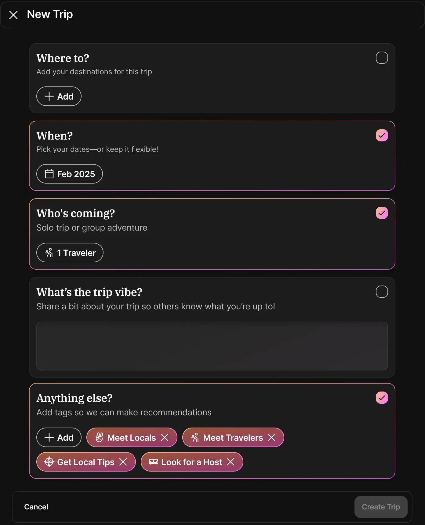
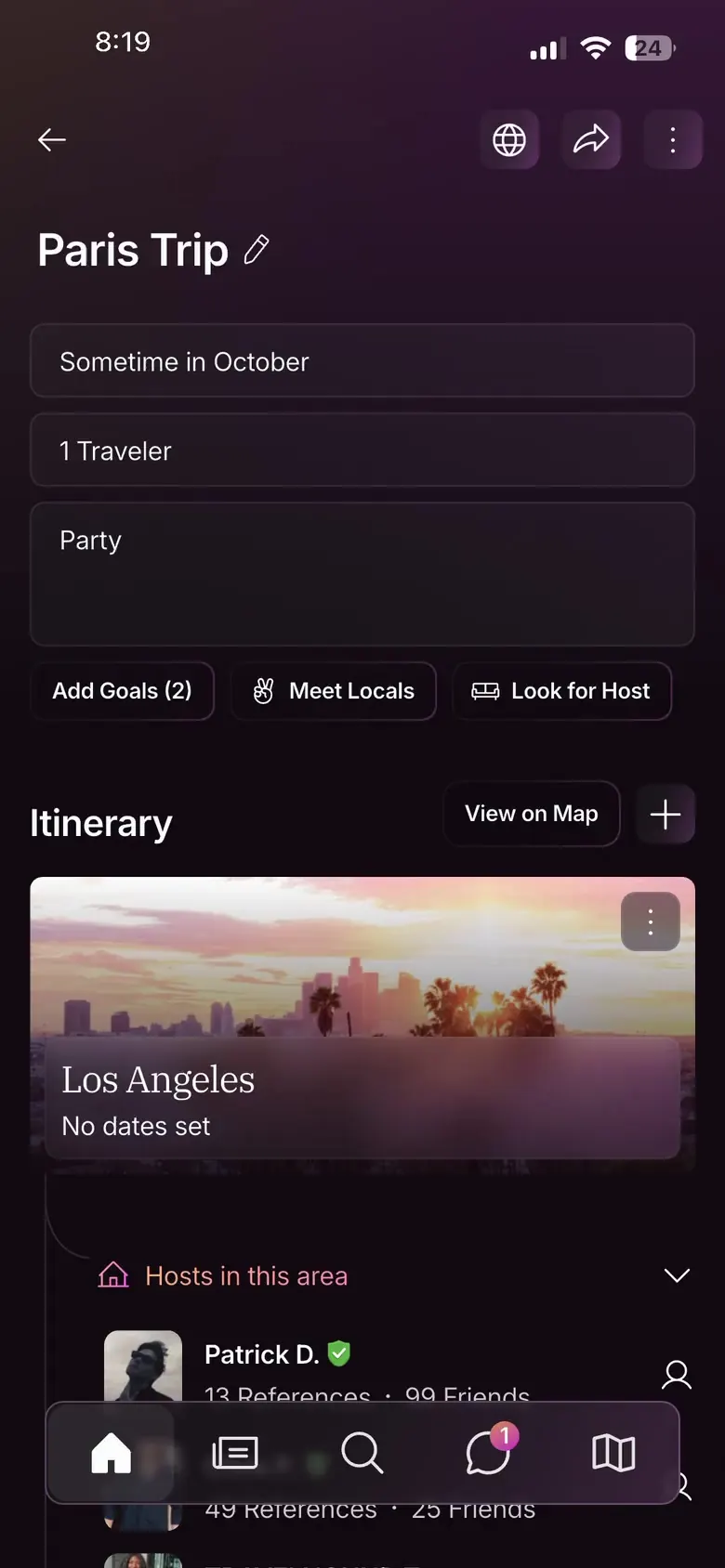
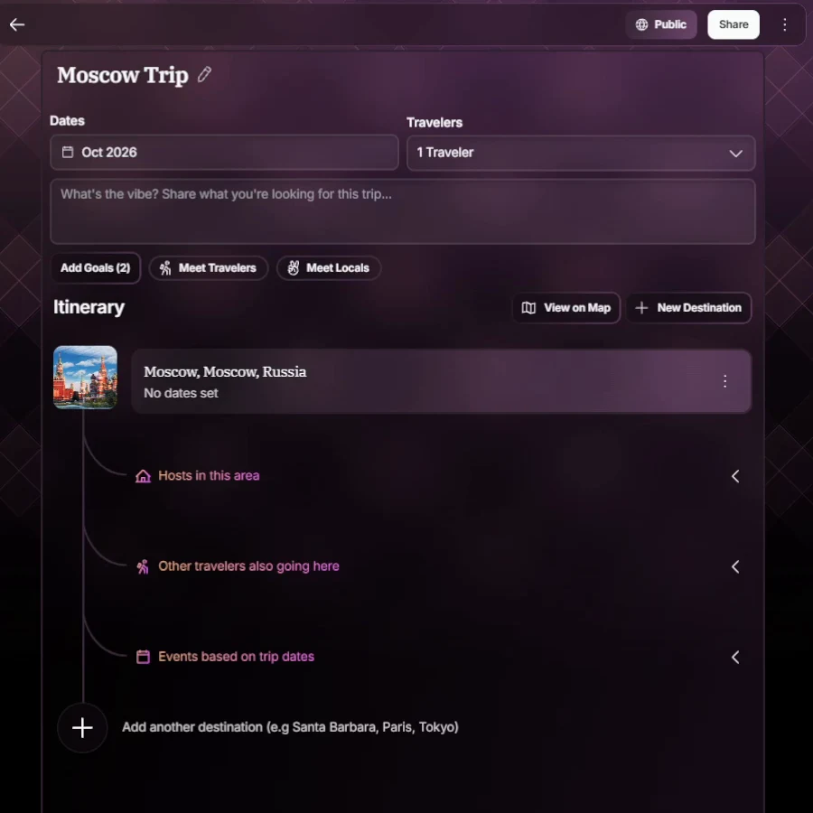
So we cut the wizard. Pick a destination, and it names the trip. The rest starts on safer assumptions a member can always adjust, in one click. The month, and one traveler, topping out at 4+.
I tested it again, the new version against the wizard, with new ambassadors. Ease, 4.6 out of 5. The ambassadors' momentum picked back up.

New Trip
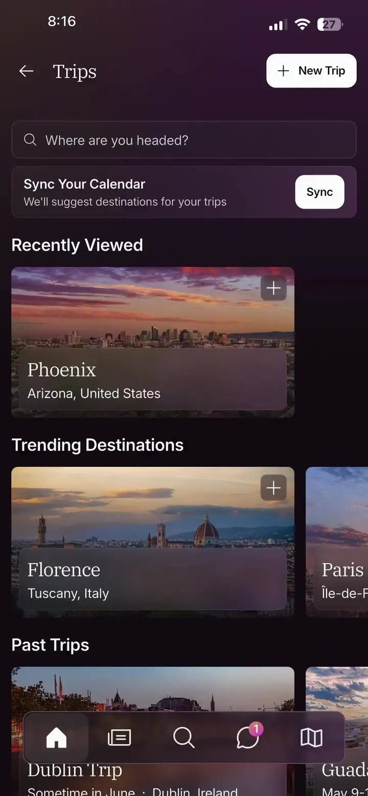
From the Trips home, into a new trip named for its destination.
New Trip
From the Trips home, into a new trip named for its destination.
Add to Trip
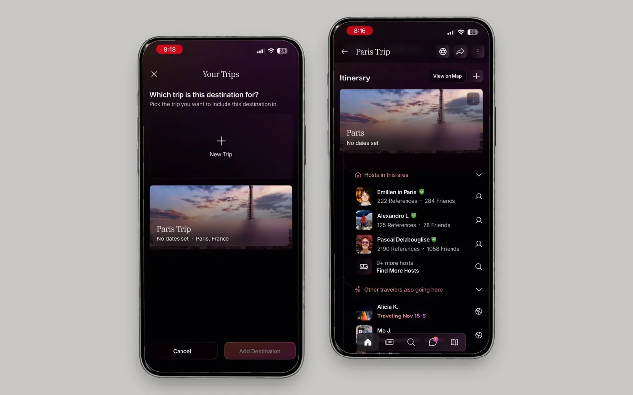
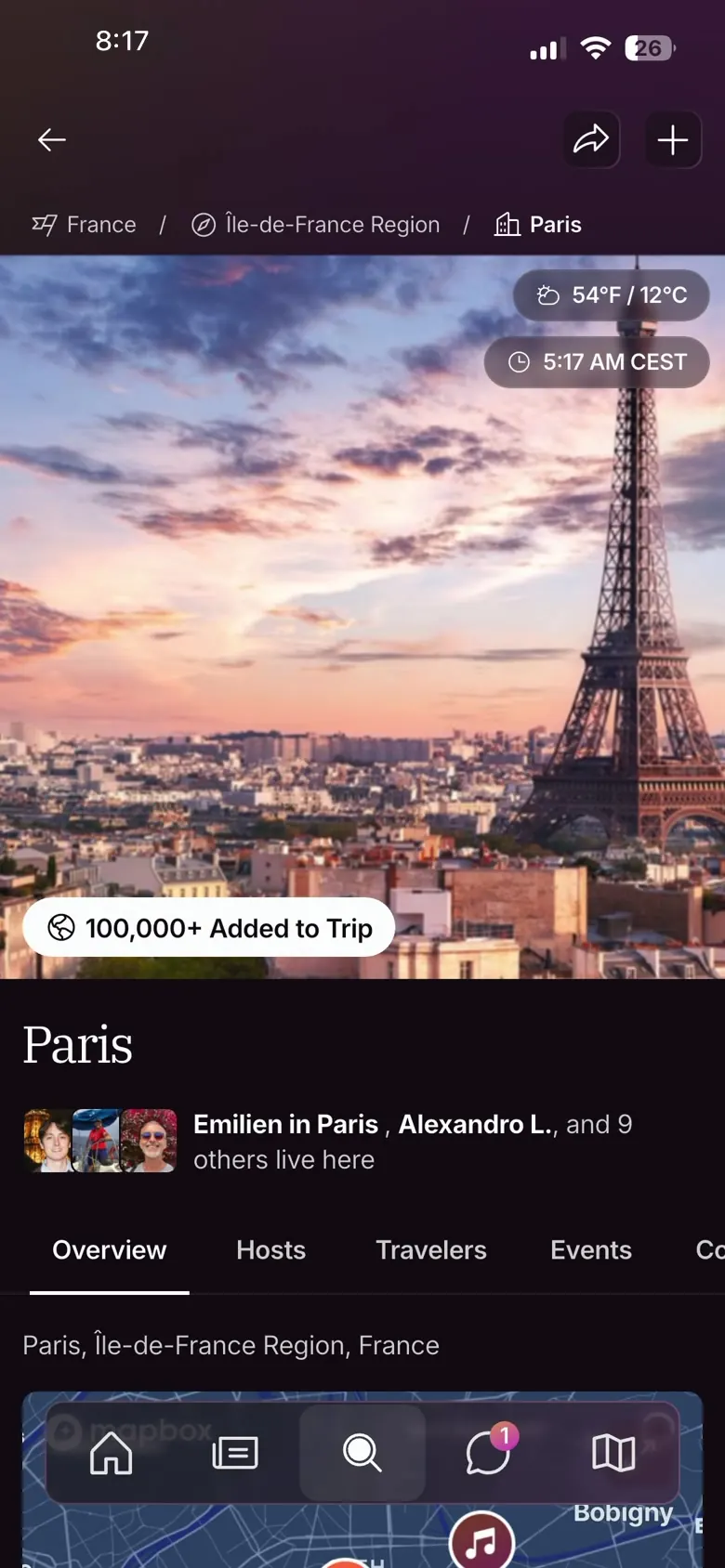
From a location page, into a new trip or one already made.
The trip page
A day planner, two full versions, and the team loved it. Cut for complexity. Every plan on a date, not the month. The developers would have had to track every plan by the day, live, as it was added, so the timeline went by the month. I wanted one group open first, hosts in this area, since that was most of why anyone made a trip. The executives wanted every group open on load, and the compromise I won was that the page remembers what you close.
For the stop card I proposed a progressive blur. Web went against it for the complexity, and what shipped is one scrim, always on, behind a blur. The timeline's lines, the thread down into the events suggested for the trip's dates, went in as a feature component.
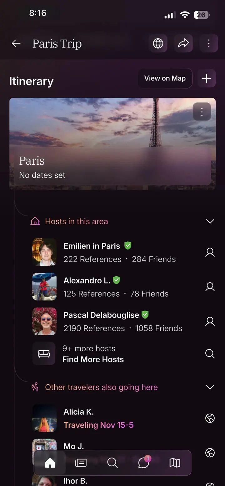
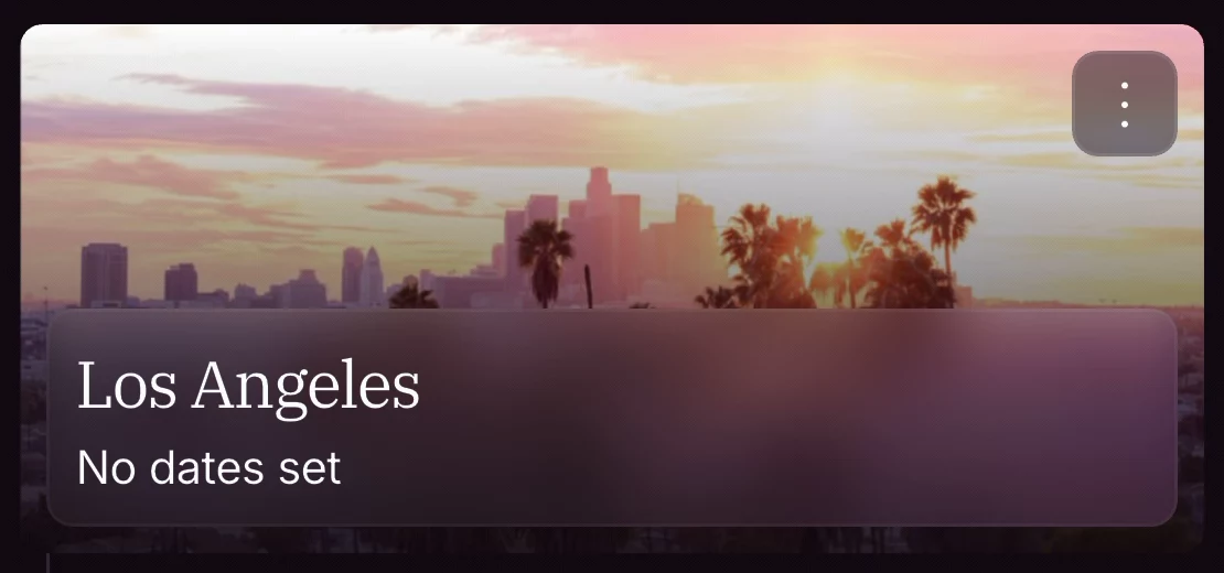

The public trip
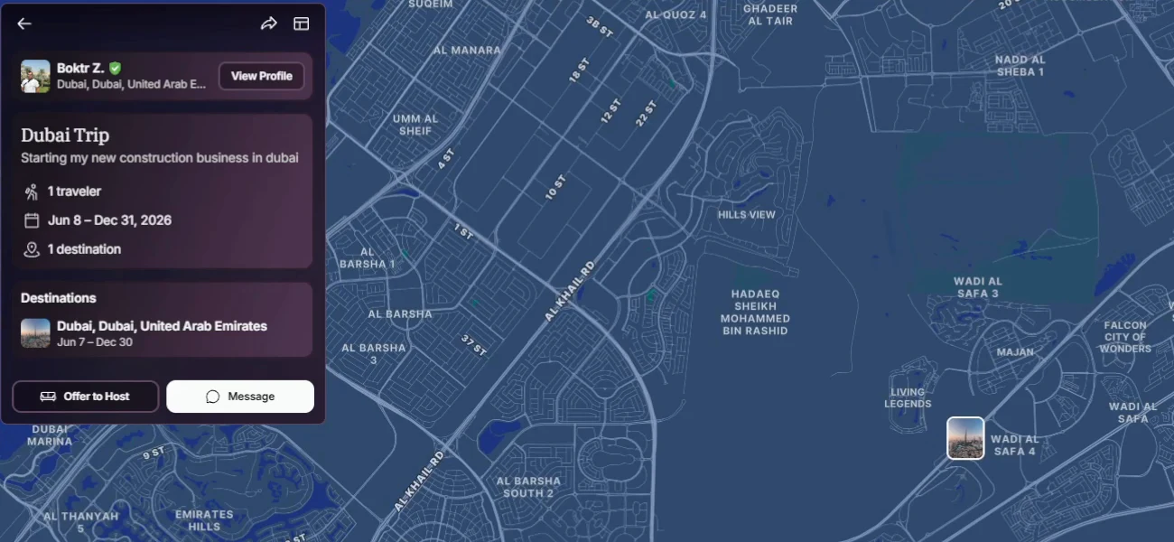
Next, the public trip. I put the person last, almost an author tag. The location first, then the trip's description and its tags, with the member lower down, there so you never forget whose trip it came from. The team moved the member to the top, because messaging them or offering to host is naturally the next step.
The gallery
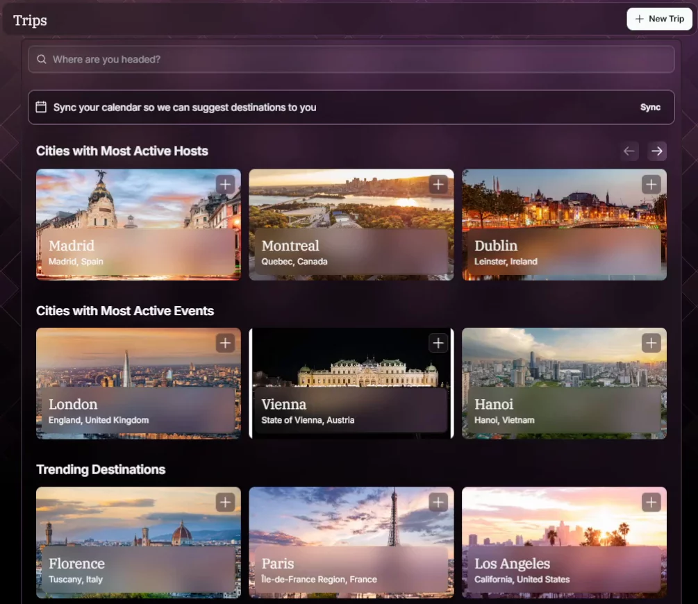
Trips opens on rows, so a new member's hub is never blank. Cities with Most Active Hosts. Cities with Most Active Events. Those two rows are mine. I wanted live trends. Bandwidth made them static rows.
Privacy
I argued for private first. The default stayed public. Friends Only is the setting I won.
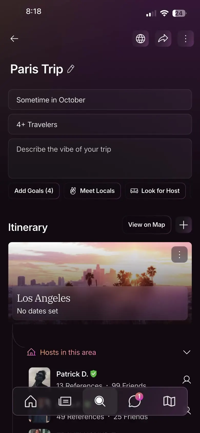
The design-system proposals
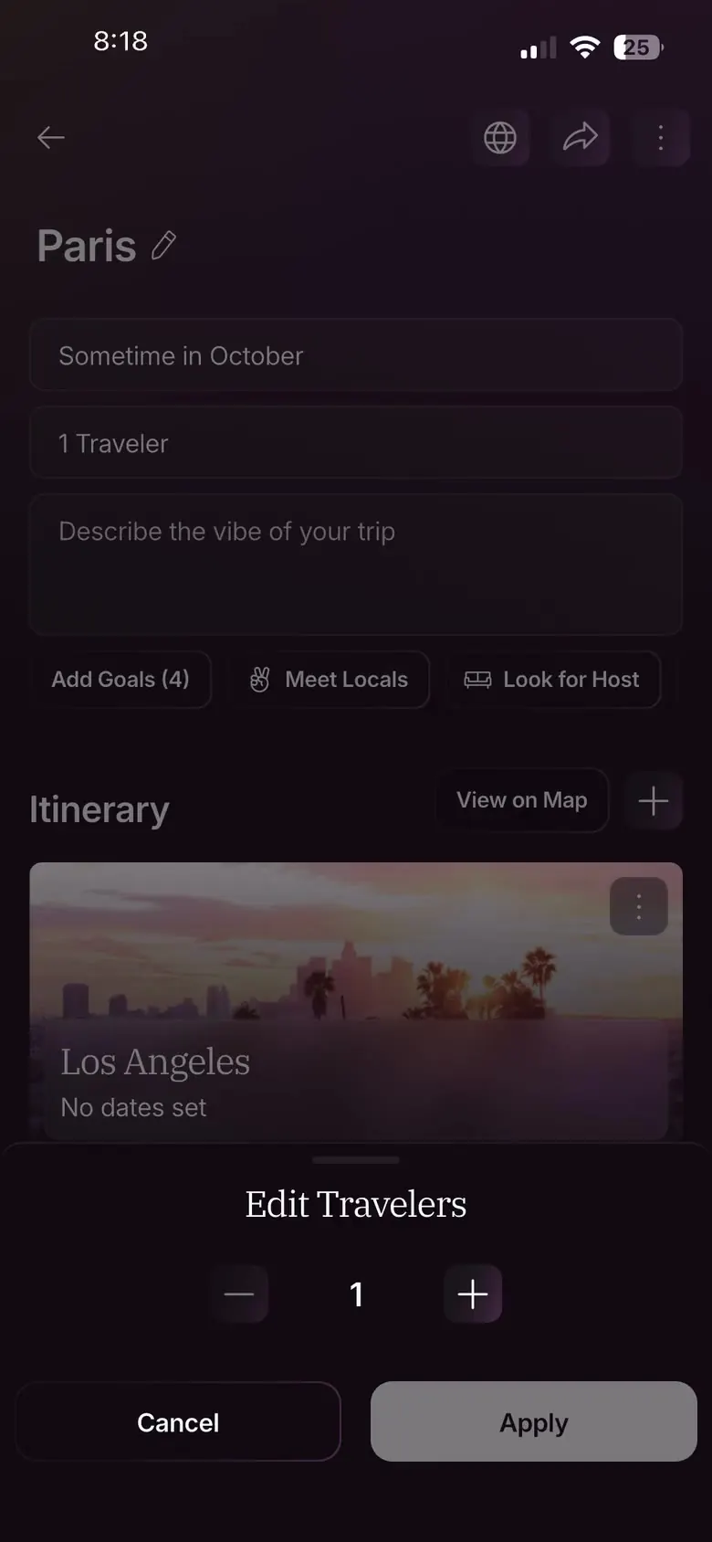
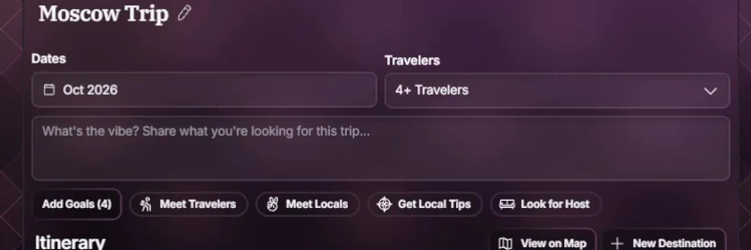
Eight proposals. Four approved. The borderless input, the accordion variants, a thinner pencil, timeline lines. Four denied, the progressive blur and the traveler picker among them. Web would have to make a new component. A couple of days. Fewer taps was the whole point. So mobile got a stepper in a drawer, and desktop a dropdown beside the dates.
It's live
6 May 2026. It's live. iOS, Android and web, in one switch with the whole redesign.
The impact
Public trips roughly tripled after launch, against the old app. More public trips a day. It came with the whole redesign, so it is the app's number as much as Trips'.
What I'd change
- The traveler picker. I would still fight for one tap.A dropdown, a drawer, a stepper and Apply, for one number. The whole point of cutting the wizard was less friction at creation, and the picker gave a little of it back for a couple of days of web time.
- Check that every event fires on every platform, before launch.Some events tracked on desktop and never on mobile, and our setup could not backfill, so the trip page's own engagement was lost.
- Bring the ambassador evidence to stakeholders sooner.In tests with the ambassadors, momentum dropped inside the wizard and picked back up on the new version. That was the evidence.
- Push harder for private trips.I argued for private first and won Friends Only. Full private was on the roadmap and cut for the effort.
No target was set. The bar I'd hold it to is about 25% core feature adoption (Userpilot, 2024). Scoped to V1, built to learn from.