Dipsea Paywall
Why does a listener who came back still not start the free trial, and what would move it?
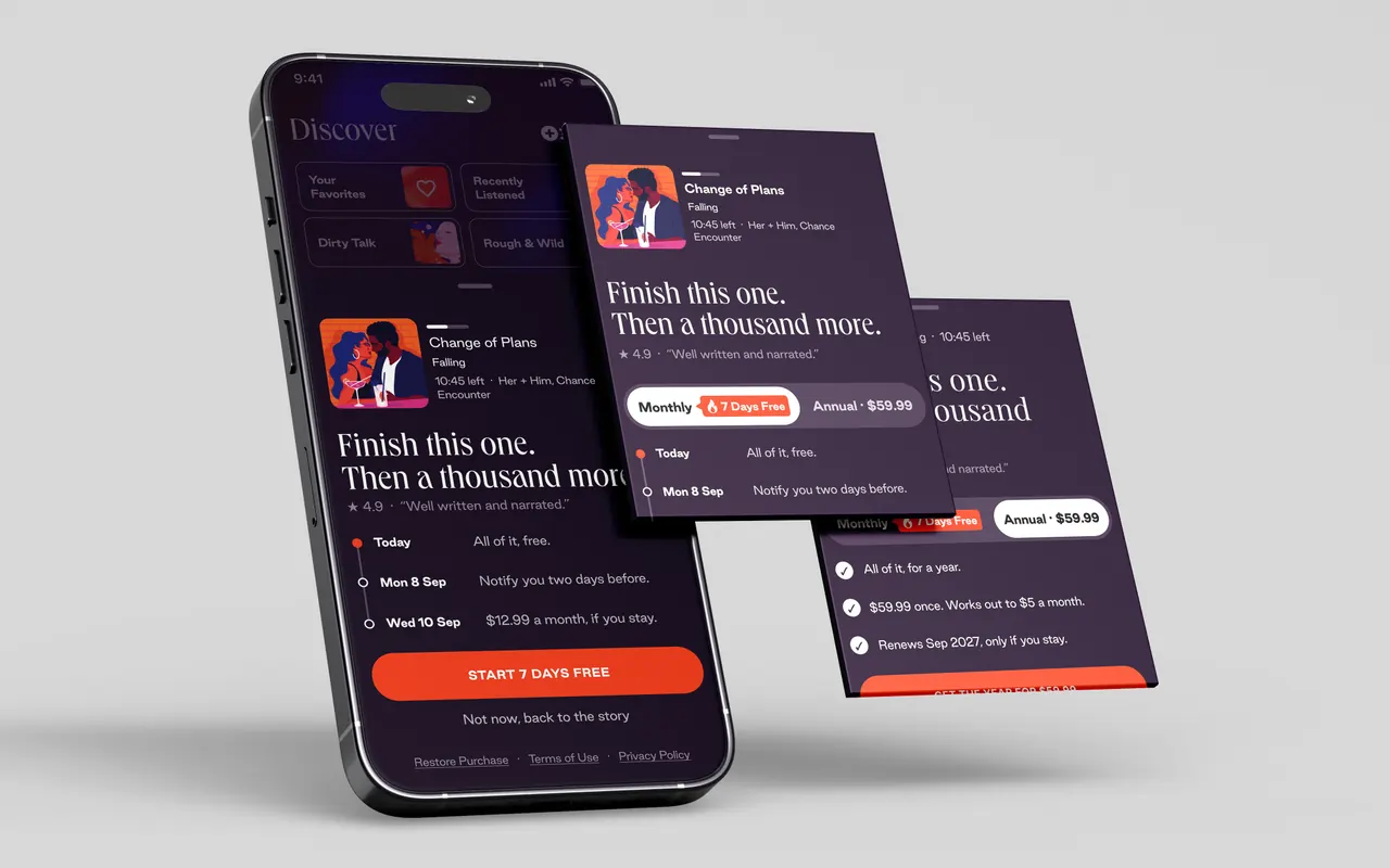
At a glance
- The problem
Returning listeners who finished a free story and closed the paywall are not starting the seven-day trial. The brief asked me to diagnose why and redesign the paywall for that segment, with one A/B variant and a way to run it.
- What I did
Read 1,082 store reviews, the app's own funnels and RevenueCat's published benchmarks. The blocker is trust and commitment before it is price. The trial reads as a trap, and the sheet asks the least committed person for a year. Built a bottom sheet that names the story they were in, carries a dated timeline of what happens and when, and puts the trial on the monthly plan only.
- What happened
Nothing shipped, so nothing was measured. What is here is the reasoning, the sheet on three platforms, a test with its decision metric and kill criteria written down before launch, and what I cut on the way.
01Scope
1,082
store reviews read and theme-coded, six App Store storefronts and Google Play
7
funnels in the app mapped to the paywall, one of them new
3
platforms drawn in Dipsea's own library: iOS, Android, desktop web
02The problem
Dipsea sells audio stories on a seven-day trial. The segment in the brief is narrow and valuable. Someone who finished a free story, hit the paywall, closed it, and came back anyway. They are not cold traffic. The plan was there and the trial was there, and they still did not start.
The paywall they meet is the one everybody meets. A full-screen takeover with a catalogue headline, four generic value cards, one plan card for the annual at $69.99, and a single line of reassurance that names the charge before the value and does not say how to cancel. Monthly at $12.99 is behind a link or missing, depending on the platform.
I designed against the Native Master design file, the system as documented
The brief asked for a diagnosis in five bullets, a redesign, one A/B variant with a hypothesis, and an experiment approach, and it gave five days. I designed against the Native Master design file, the system as documented, rather than the live app, and kept what I saw in the live app as background. The five days went on the diagnosis, the sheet and the experiment design, so no usability testing was run.
03The diagnosis
Trust before price.
I pulled 682 App Store reviews across six storefronts and 400 Google Play reviews, coded them by theme, and read the app's own cancellation survey, which offers three reasons to leave: price, frequency, fit. Then I weighed the blockers for this segment against RevenueCat's and Adapty's published test data. The findings, with the case against the first written next to it.
The trial reads as a trap.
"I cancelled and was charged anyway" is 84 of the 367 negative reviews on both stores, and 37 percent of the negatives written since 2025. When a reviewer names a price it is $69.99 or seventy dollars, the annual. Nobody names $12.99. The paywall's one reassuring line does not say what happens on day seven or how to cancel. The fear is ambient. Those reviews sit on the store page every returning listener reads before deciding, so they reach this segment, who never started a trial.
This segment did not complain.
They are the ones who could. The diagnosis reads the reviews as a prediction, and the sheet is built to keep these listeners from writing the next batch.
Annual-first asks the biggest commitment of the least committed person.
The file preselects the annual at $69.99, about 1.8 times the $38.42 median annual price for the Entertainment category in Adapty's 2026 report, and hides monthly at $12.99, which is that category's median. The research board quotes both figures. This person already declined that pitch once. Showing it again, preselected, is the same experiment with the same result.
The paywall sells the catalogue.
The listener wants the story they were in. Nothing on the screen names the series, the chapter, or the minutes left, and the components to show them already exist in the file.
No proof, no reassurance, and the wrong register.
No rating, no listener's words, nothing about discretion, and a headline word that a listener would not want seen on the one screen they are most likely to be caught with. Five-star reviews praise safe and discreet.
One paywall for everyone is no paywall for this segment.
The first-open listener and the returner locked out mid-chapter get the same screen. RevenueCat's own placement guidance lists a separate offer for existing users after a core feature. The file has no state that says you have been here before.

04The bet
Lower the felt commitment. Leave the price alone.
The instinct with a low trial-start rate is a discount. The reviews say the blocker is commitment and trust, so a discount answers a question nobody asked. The move is to make the ask smaller and the trial legible.
Two decisions carry it. The trial lives on the monthly plan only, so no trial can end in a $69.99 charge, which removes the loudest complaint at its source, and the annual becomes a purchase someone makes with their eyes open. And the sheet shows the dates money moves: today, the reminder, the charge. A trial with dates on it is a promise. Without them it is the trap the reviewers describe.
The cost is stated on the frame as a loud assumption. Leading with monthly gives up annual revenue at this touchpoint until the test says otherwise. Annual keeps its home in the reminder and on the account screen. In a real engagement the first check is RevenueCat's own charts for this cohort, trial starts and plan mix by default plan, and if annual-default starts are not lower, the decision flips.
05The sheet
A bottom sheet over the story they were in.
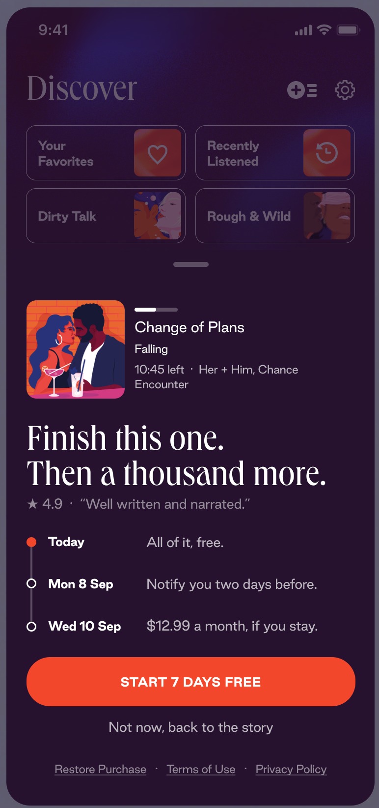
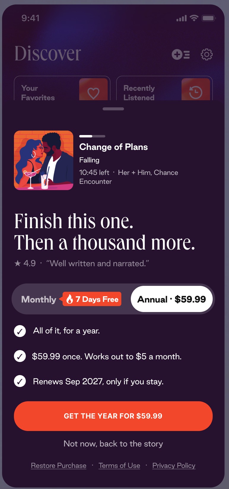
One plan
The base sheet. No plan control, no annual anywhere on it. The price lives in the charge row of the timeline.
- 01The story rowThe app's own in-progress list item: the series, the chapter, and the minutes left. The thing they came back for, named.
- 02Headline and proofFinish this one. Then a thousand more. Under it, a listener's words with the rating, chosen for production quality rather than value.
- 03The timelineToday, all of it, free. Two days before the charge, a nudge. The charge date and the price, only if you stay. Dates from the device.
- 04The button and the way outStart 7 days free, and under it Not now, back to the story, which returns to the free segment with the lock in place.
One plan
The base sheet. No plan control, no annual anywhere on it. The price lives in the charge row of the timeline.
- 01The story rowThe app's own in-progress list item: the series, the chapter, and the minutes left. The thing they came back for, named.
- 02Headline and proofFinish this one. Then a thousand more. Under it, a listener's words with the rating, chosen for production quality rather than value.
- 03The timelineToday, all of it, free. Two days before the charge, a nudge. The charge date and the price, only if you stay. Dates from the device.
- 04The button and the way outStart 7 days free, and under it Not now, back to the story, which returns to the free segment with the lock in place.
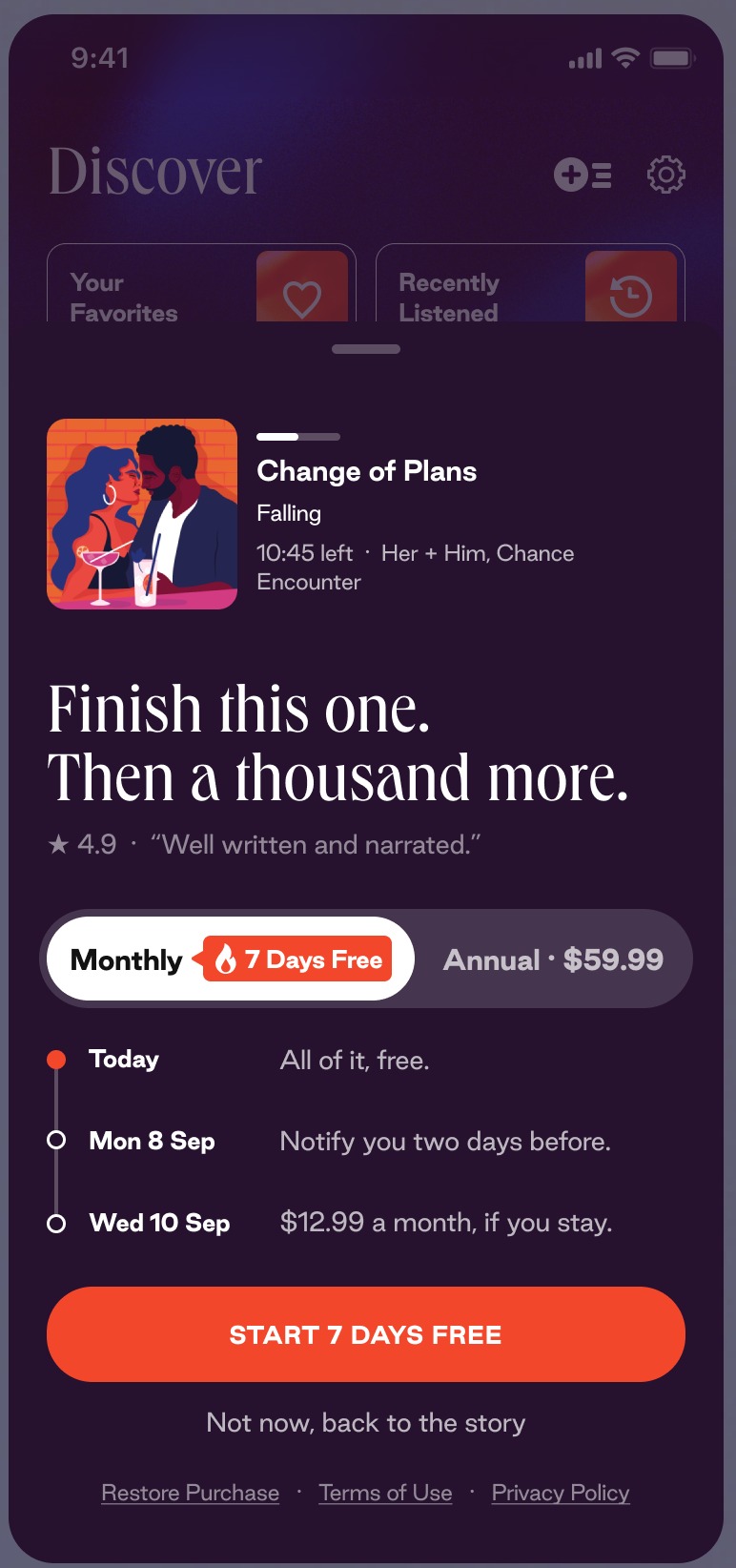
Two plans, monthly
Arm B with monthly selected. Whether annual belongs on this sheet at all is what the first test asks.
- 01The plan controlA white segmented control, so colour is not competing. The selected segment is white with dark text, the other reads at 70 percent.
- 02The pill7 Days Free rides on the monthly segment with the library's flame pill, and stays visible when annual is selected, so the free option keeps pulling.
- 03The same timelineNothing else on the sheet moves when the plan changes. The sheet is 651 tall in both states, so a switch never shifts the button.
Two plans, annual
Annual selected. The trial does not come with it. The annual is a purchase someone makes with their eyes open.
- 01The checklistThe timeline becomes three ticked rows: all of it for a year, the price once and what it works out to a month, the renewal date, only if you stay.
- 02The button says what the tap doesGet the year for $59.99. That label was a catch in review. The old one would have charged the year under a button that said free.
- 03The same slotThe checklist sits in the timeline's 104 pixel slot, so the sheet holds its height and the button stays where the thumb left it.
A sheet with a grabber, over the dimmed player, so the artwork and the scrubber stay in view. The story row at the top is the app's own in-progress list item: the series, the chapter, and the minutes left. The headline reads "Finish this one. Then a thousand more." and the proof line under it is a listener's own words with the rating, chosen for production quality rather than value, since the timeline handles price.
The timeline is three rows with a dot for each. Today, all of it, free. Two days before the charge, we nudge you. The charge date, $12.99 a month, only if you stay. The reminder is its own row because a dated event is a promise, and the same words under the charge row read as a caveat. The dates come from the device.
The button always says what the tap does
On the two-plan sheet a white segmented control carries Monthly with the library's 7 Days Free pill, and Annual at $59.99. That is the design file's price. The live app charges $69.99, which is the number the diagnosis uses, and I designed to the file. The annual side replaces the timeline with three ticked rows: all of it for a year, the price once and what it works out to a month, and the renewal date, only if you stay. The button always says what the tap does. Start 7 days free on monthly. Get the year for $59.99 on annual. That label was a catch in review. The old one would have charged the annual under a button that said free.
the trial appears only in the button and the timeline, since Play's rules keep it out of the benefit strings
Android leads with reliability, because Google Play's top complaint is bugs and login rather than billing. The cancel path is Play's own, the reminder is Play's renewal notice plus the app's, and the trial appears only in the button and the timeline, since Play's rules keep it out of the benefit strings. Desktop is a centred modal over the dimmed home, the way the site already handles its age gate, with the FAQ left on the page under it.
Orange has a budget: the button and the selected state, and the first dot on the timeline
On the smallest phone, the iPhone SE, the story row folds to a one-line strip and nothing scrolls, with the headline the same on every size so device height stays out of the test. Orange has a budget: the button and the selected state, and the first dot on the timeline. Three type levels under the chrome, three contrast tiers, controls at 48 pixels, content left-aligned and actions centred. Money and dates are store-supplied strings rather than typed copy, because six storefronts pay in six currencies, and the control was checked with the longest of them.
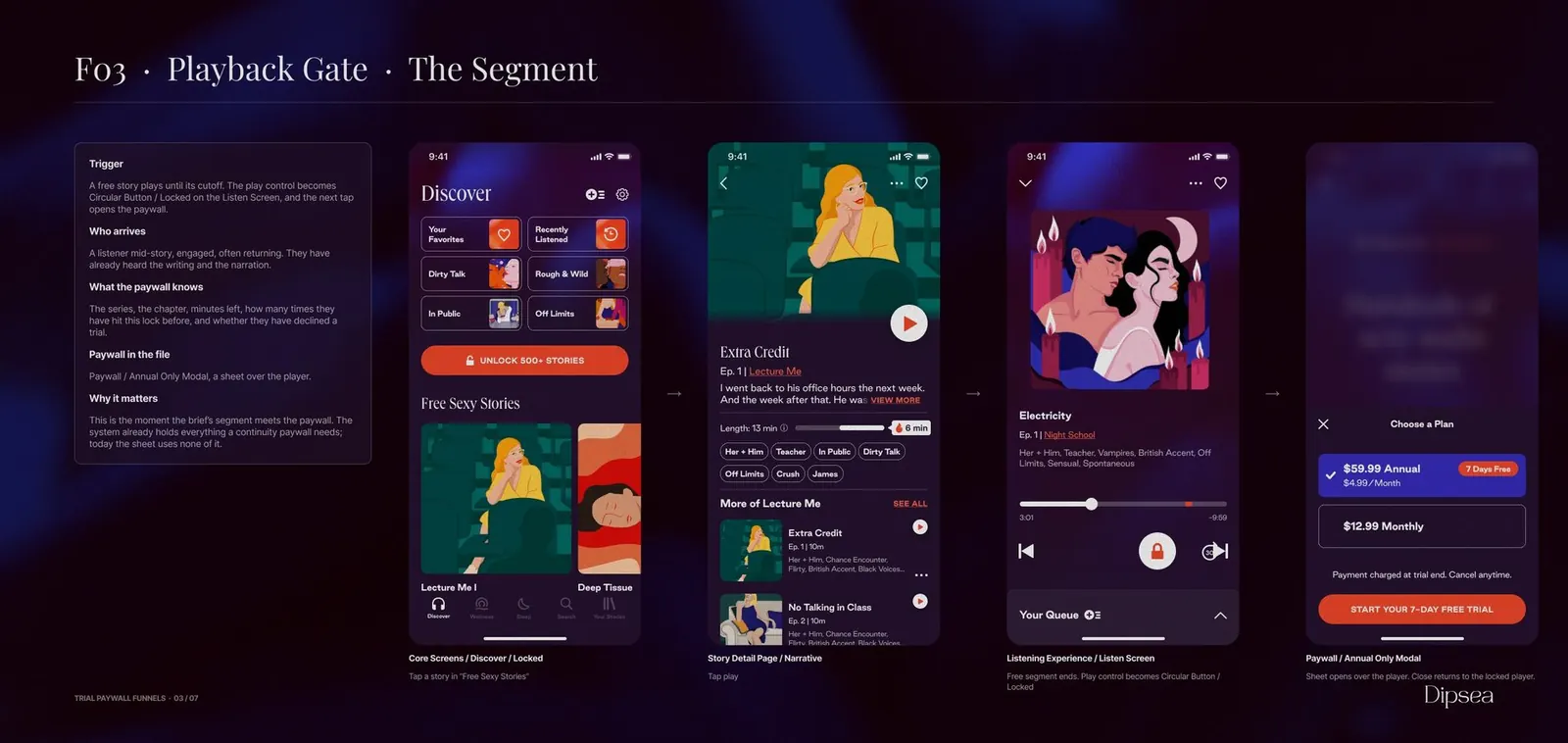
06What I dropped
Cut for hierarchy, for the test and for the room.
Annual on the base sheet, with monthly selectedOne variable per test.If the barrier is a scary annual plan, the base sheet should not carry it. The one-plan sheet became arm A, and whether annual belongs on this sheet at all became the first test, rather than a default-plan test that would change plan count and default at once.
A proof card, a cancel-path line and a story count under the headlineThree things fighting the headline.Each competed with the timeline for the reader's second look. The proof shrank to one line of a listener's words, the cancel promise moved into the charge row, and the story count went, since a count is not proof of quality.
The catalogue headline with the brand's word for heat in itNot on the screen they get caught with.The one screen a listener is most likely to be seen with should not carry it. The register the brief asked for was premium and not overt. Heat lives in the story's tags instead.
A light-mode paywall variantIt tests a brand change.The whole app is dark. A light sheet over a dark player would test the brand, not the paywall, and the one case for it was a single vendor story about an app that was light elsewhere.
07The experiment
More trial starts, counted once they have paid.
The brief's goal is trial starts and the sheet is built for them. The plan changes one thing about how a winner is called: extra starts only count once they have paid. Everything below was written before launch, in the file, so it cannot move after the numbers come in.
Test one is plan count.
Arm A is the one-plan sheet. Arm B is the same sheet with the segmented control above the timeline. One variable, whether annual is offered on this sheet at all. It goes first because it has the most published evidence against my own reading: RevenueCat's study of 32 million paywall interactions found two products beat one, and Adapty puts plan count at the top of its win-rate table.
The hypothesis.
For returning non-subscribers shown the sheet at the locked state, a single monthly plan with a dated trial moves paying subscribers per exposed user up, because it removes the two things they said stop them, the year-long ask and the surprise charge.
The call.
Trial starts per exposed user is the first number read, from day seven. The winner is called on paying subscribers per exposed user at day 35, at a 95 percent chance to win with a credible interval clear of zero. A sheet can win on trial starts by hiding the price or the charge date, and those starts do not pay.
Arm A can win subscribers per exposed user and lose money.
The deck says so. Monthly gives less revenue per user than annual up front, and may give a longer lifetime for the same reason. A trial that never starts gives zero of either. Subscribers per exposed user says whether the sheet did its job. Revenue per user is read as the guardrail after it.
Guardrails and kill criteria.
Day-zero and day-one cancellations against RevenueCat's benchmark of 39.8 percent on day zero, trial-to-paid at day 35, refunds and ARPU at day 60, support contacts about cancel or charged. The test stops on harm only: refunds two points over control, day-zero cancellations five points up, or paying subscribers meaningfully under control. It does not stop on an early win, which turns a five percent false-positive rate into about 26.
Sample and duration.
The segment's baseline is unknown, so the first week measures it before the sample is fixed. At a working three percent, a 50 percent relative lift needs about 2,500 exposed users an arm, a 15 percent lift about 24,200. So test one changes the structure rather than the copy, and it runs at least 14 days with trial-to-paid read 14 days after the last enrolment. I did not fix a floor for the smallest runnable exposure. It falls out of the calculator at whatever confidence the team sets, and I would not name one from memory.
Then.
The timeline and reminder on versus off, on the winner, once the reminder exists. Then placement: the sheet on open after about 600 milliseconds plus the playback gate, against the gate alone, with reactance and support contacts watched. The seven-day trial is held constant. A trial on annual is not in this plan. It should follow placement, and I would add it.
The plan runs one clean test first.
Without the demographic numbers I could not be sure a cohort would reach the minimum detectable effect at the confidence I wanted. Trial length is the strongest lever in the published data and it changes the SKU, which is outside this brief.
08The impact
Nothing measured
This was a take-home. Nothing shipped, nobody was exposed, and there is no number on this page that was read from a live test. The evidence on the page is other people's published tests, cited where they are used, and 1,082 reviews I read myself.
The Figma file with the research, funnel and tools pages, the sheet on three platforms, and the pre-registered test plan. I can walk through any of it on a call.
09How it was built
The file is the deliverable, so the file had to prove I understood their system. I used Dipsea's Native Master file as the library, inside my own workspace, and built the research, funnel and tools pages on it, with a style or a token on everything I authored. There was no agreement on the exercise and nothing private was handed over: every number in the diagnosis came from public store pages and public interfaces I pulled myself. The design file was theirs. I did not ask to republish it and did not. What is on this page is my work built on it. The exercise did not go forward to an offer, and the study stays because the method is the point. A client with no data and no baseline still needs a hypothesis and a design. The reviews came from Apple's public feed and one scrape of Google Play. Five deep-research runs read RevenueCat's and Superwall's own paywall writing so the plan cites the reviewer's data back to them.
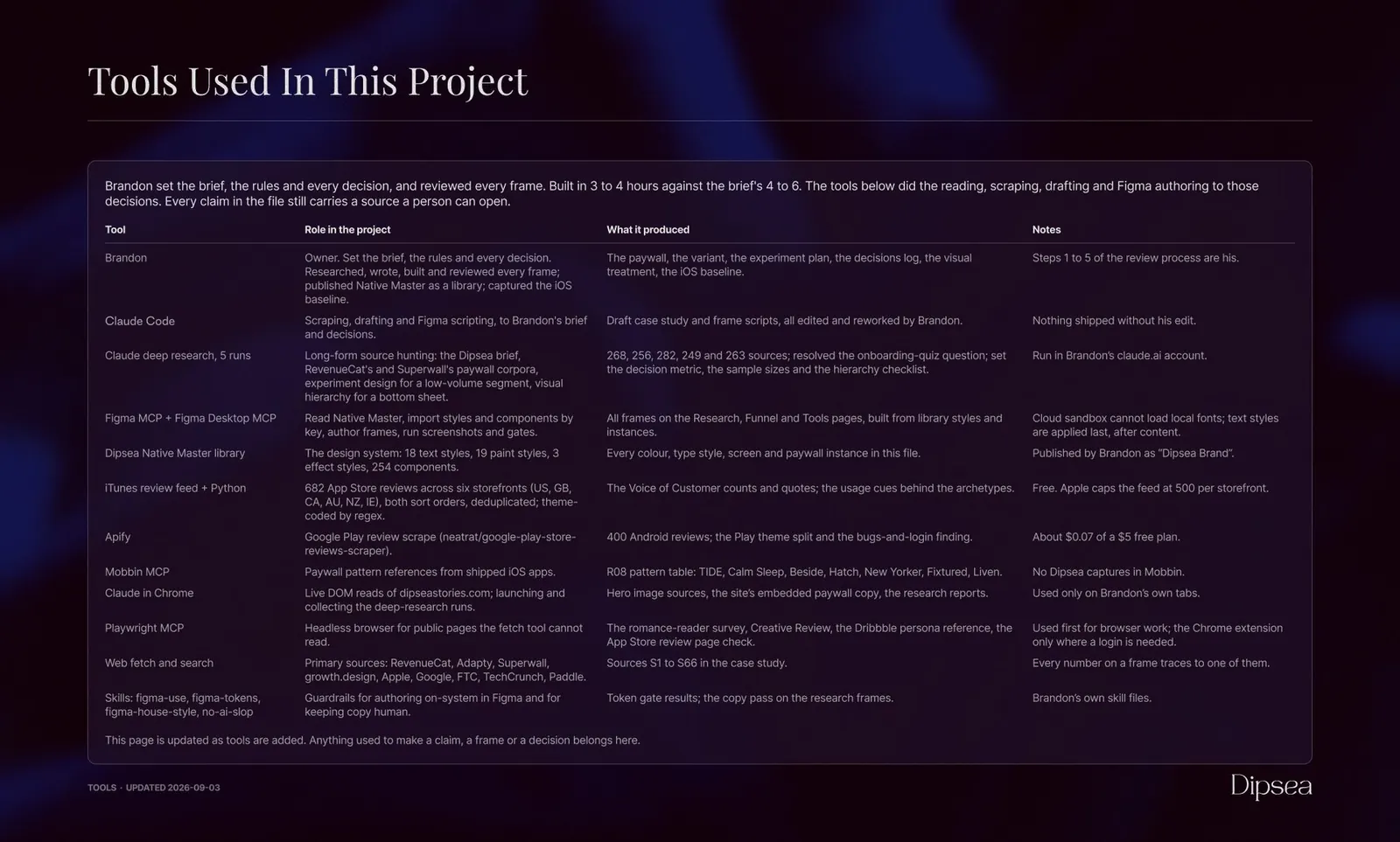
AI tooling did the scraping, the summaries, the drafting and the frame authoring, to my brief and my decisions, and I read the reviews myself. I set the rules, reviewed every frame, and made every call in the decisions log, which is written the way this site's is: what was decided, why, and what else was considered. Nothing went into the file without my edit.
One thing I would do differently. The commercial recommendation, monthly as the smaller ask and what it trades, should have been the first page of the file rather than distributed through it. The trust work is real and it serves the money story best when the money story is stated first.
10What I would measure next
- Trial starts per exposed usershare of exposed, from day 7The brief's goal and the leading read. The number the sheet is built to move.
- Paying subscribers per exposed usershare of exposed, at day 35The decision metric. Extra trial starts only count once they have paid. Called at 95 percent chance to win.
- Day-zero trial cancellationsshare of trialsThe guardrail the dated timeline exists to protect, read within days against the 39.8 percent benchmark.
- Refund rateshare of subscriptions, at day 60The kill criterion, with support contacts about cancel or charged counted beside it. A transparent trial should lower both. Two points over control stops the test.