Key Moments in
The Design Process
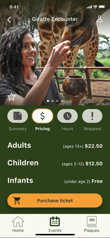
Detailed Info
Giving Users The
Info They Wanted.
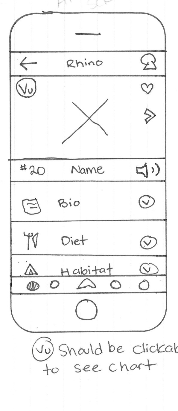
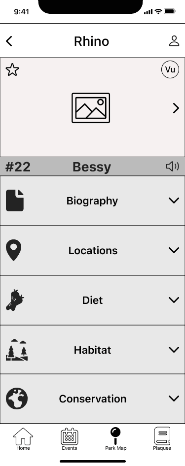
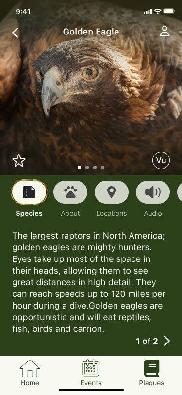
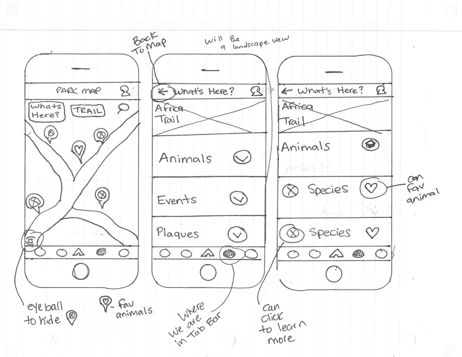
I knew I wanted the animals to be the focal point of each plaque, so I started creating a design that really let them speak for themselves. How could I incorporate personal details about the animal without creating too much information on the screen? I began making ways for interactive elements to handle this task. Although I ended up with a finished product with screen 3, something didn’t feel right. During our guerilla usability test, some users had issues with knowing what elements were due to the number of elements in their faces. There wasn’t enough balance here to make users not feel overwhelmed. I redesigned my screens and ended up with something a bit more minimalistic.
Navigating
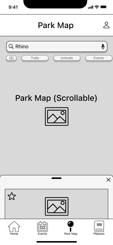
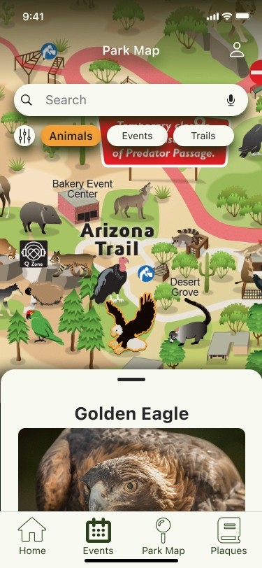
Fun and Interactive
I wanted visitors to be able to explore the map and find things around the zoo without having to be walked through it step by step. At first, I considered adding similar icons that Google Maps uses to show what is around the park map, but that didn’t seem “fun” to me. So instead I added an illustrated park map and thought about how I could take it to the next level. I added small elements like being able to click the animals on the map to make it more interactive, but due to time constraints on my project, I made just enough interactive so that I could get my usability tasks done.
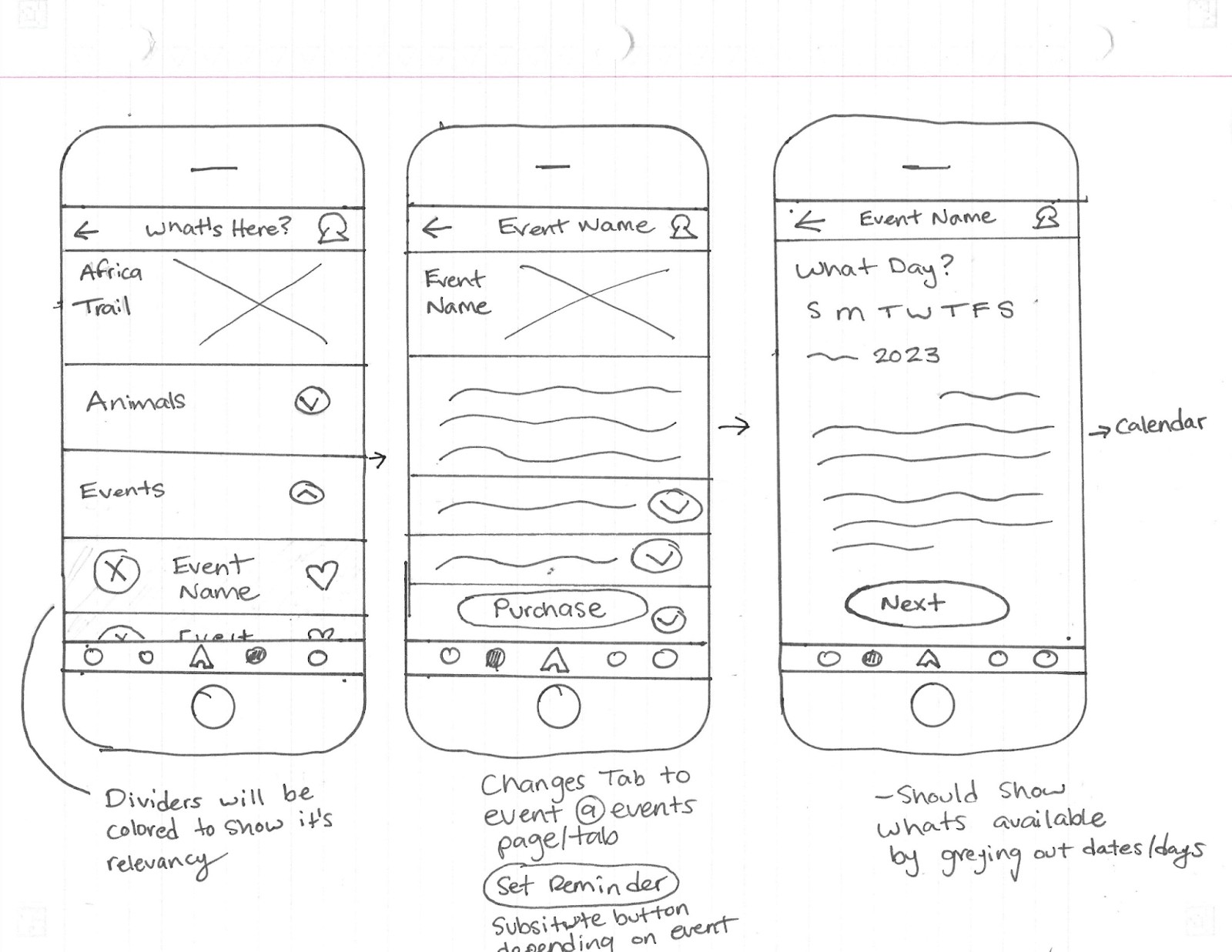

Events
New Ways
to Purchase