indieNOW
-
iOS/ANDROID APP DESIGN
Uniquely Diverse but Somehow Familiar

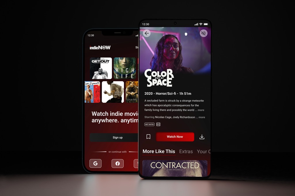
indieNOW launched an indie movie product two years ago. It is a freemium model with a mobile-web experience and a mobile app for iOS and Android. The company’s business strategy was to first build a user base by offering a free product and then evolve the feature set so they could monetize on a premium (paid) product.
To increase revenue indieNOW needed to introduce a way to incorporate a subscription model to improve their profitability stream. The challenge was to come up with a plan that would allow current users who have been enjoying the service for free, to continue doing so but also provide an option for those who would like to upgrade their watch experience by paying a monthly subscription fee.

The Solution
iOS/Android App
The new experience is designed as an add-on that can be accessed from within the main app and includes a seamless transition from free features to subscription benefits. I was given this challenging task with a 90-hour time constraint and worked on all aspects of the design which included its visual, UX, and motion design.
The Competition
Research Analysis
When I started this project, I knew that the onboarding process was going to be an important aspect of achieving our business goals. I didn't have much experience with onboarding before and wasn't sure how to approach it, but after looking at other companies' processes, I was able to get a better sense of what I could do. I found that our competitors had a clear, and simple onboarding process that let users know about new features and plans as well as how they could upgrade at any point in the app.


The Design
What Did Users Want?
No Ads. 1080p and No Media Block.
Allow users to watch favorite movies and shows in HD without the distraction of ads or the annoyance of media blocks.
Recommendations From Friends and Family.
Allow users to discover new content via their friend's ratings on the app.
Tailored Recommendations From Onboarding.
Design a journey for the user to get customized recommendations, especially those who are new to the independent film industry.
These features needed to be included in the final design to meet the expectations users had. To accomplish this, I needed to start thinking about how users would flow through the app and develop these screens first.
When we asked users to upgrade their accounts, they found it hard to see the difference between their current plan and a new plan. I empathized completely and decided to create a plan screen that showed their current plan and a swipeable carousel to compare the two side by side.


