The Client
Conservation Activists
The role of zoos in conservation continues to grow and with it so do their needs; they provide space for breeding programs and allow researchers to study species that may not be found in the wild. In addition, zoos help educate visitors about wildlife and conservation efforts, which can increase support for conservation overall. They heavily rely on donations, city/state aid, and ticket purchases from zoo visitors to continue funding these programs.
The Challenge
How Do We
Encourage Learning?
To increase engagement and understanding of wildlife's vulnerability, public learning about them is vital. Zoos can host tours and interactive events, but those are expensive, and not all tour guides are built with the same drive and passion; this leaves us with a particularly hard question to answer: How do we create something that encourages or gives new ways for visitors to learn more about the animals and events at a zoo? I was given this challenging task and worked on all aspects of the design which included its visual, UX, and motion design.
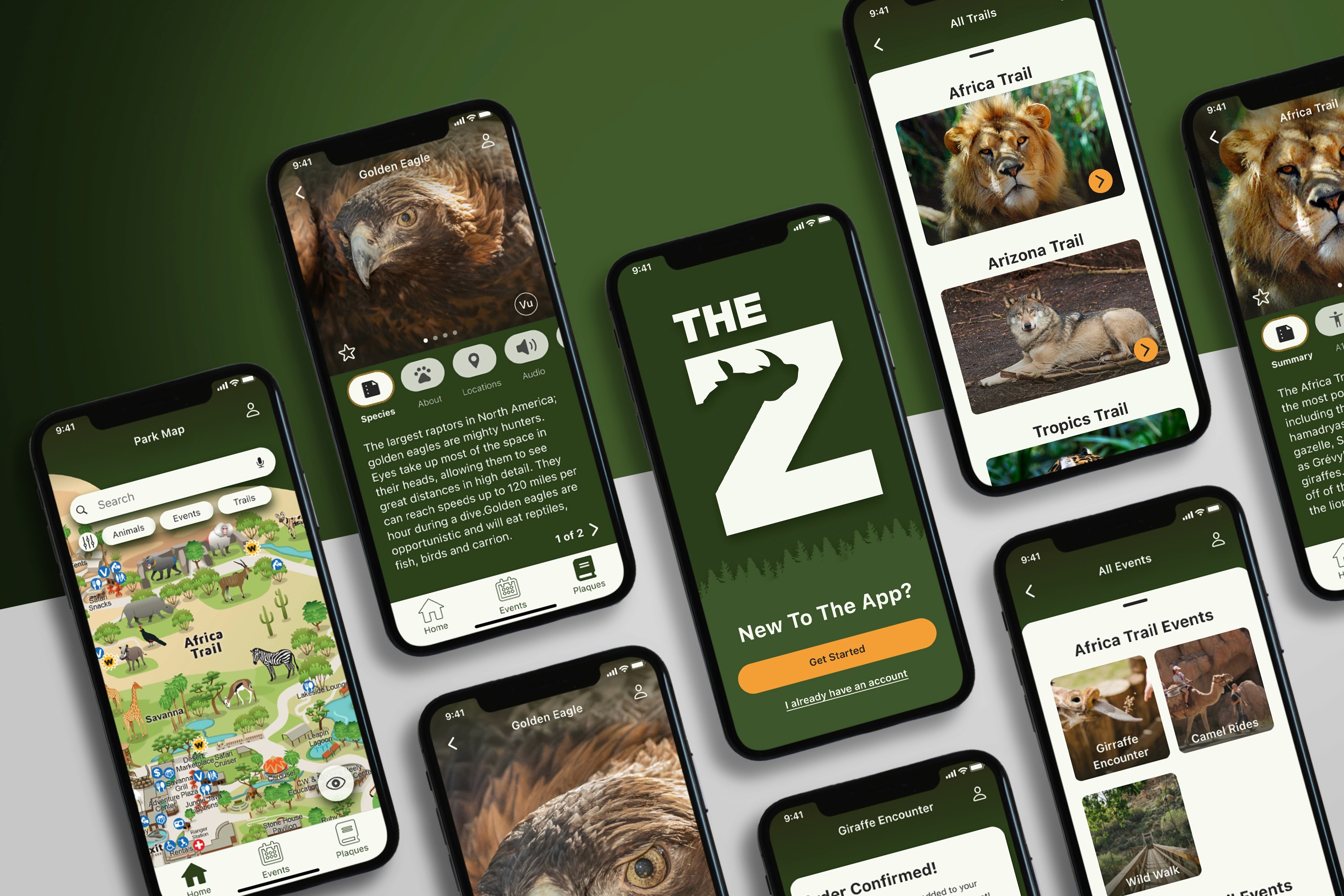
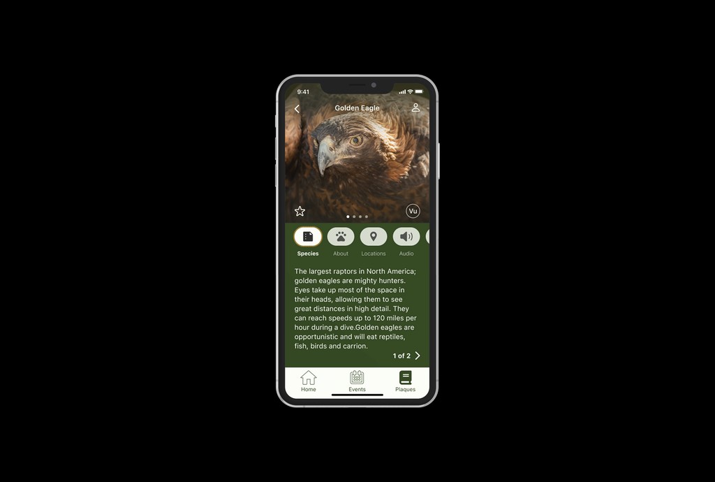
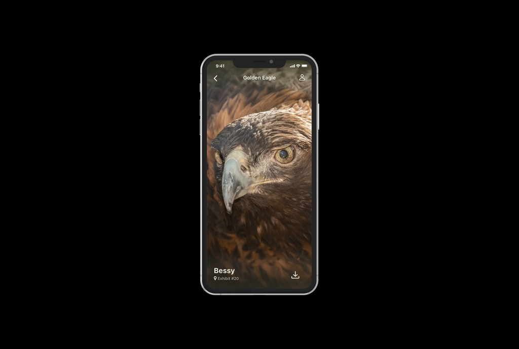
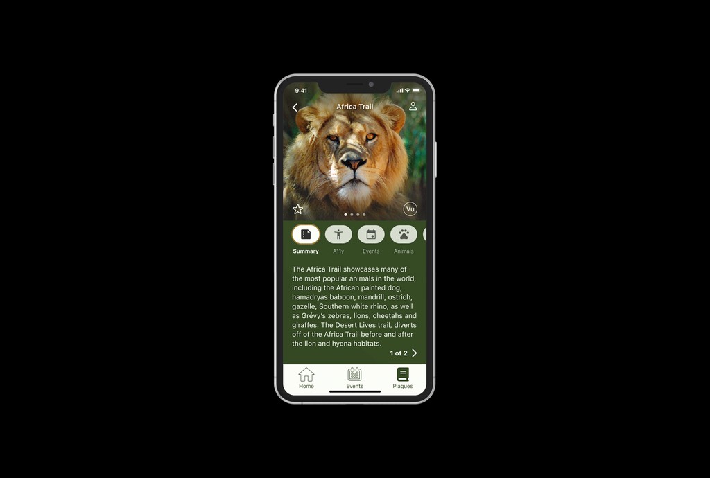
The Zoo app provides a mesmerizing experience, allowing guests to connect with the animals, learn their stories, and discover local events. The Zoo app extends the zoo's reach beyond its physical footprint bringing itself into the modern era. The app provides users with information on animals, ongoing or current conservation efforts, and stewardship while also providing additional revenue opportunities via ticket sales to events.
When it comes to learning, the most important thing you need to let your users have is the freedom to explore what they want, and not force the information on them. They need to feel as though the learning is tailored to them if we want them to remember their visit and the effort the zoo makes.
Throughout this project, users were adamant about being able to read more about animals; it was mentioned 37 times in total. I started by creating designs that focused on the animals and their journeys both at the zoo and in the wild and gave the user the freedom to explore that journey.
The Design
What Did Users Want?
Detailed Information About Animals.
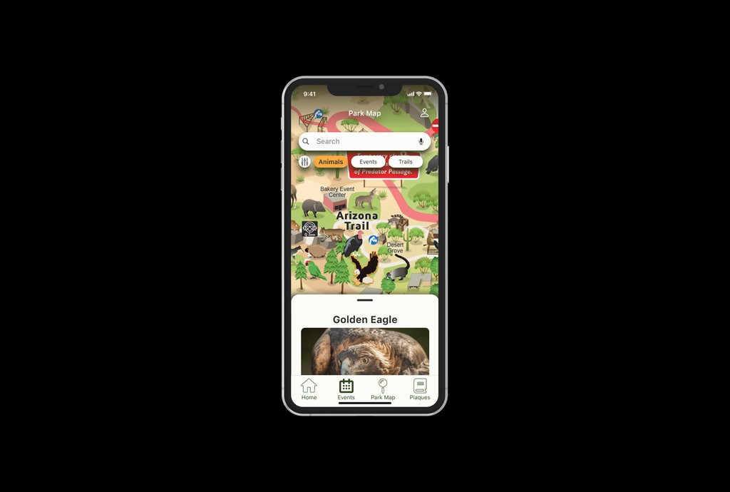
Give information like the animal's backstory, diet, habitat, vulnerability, and conservation efforts.
Explore and Find More Information.
Add ways for users to discover and find more information throughout the app.
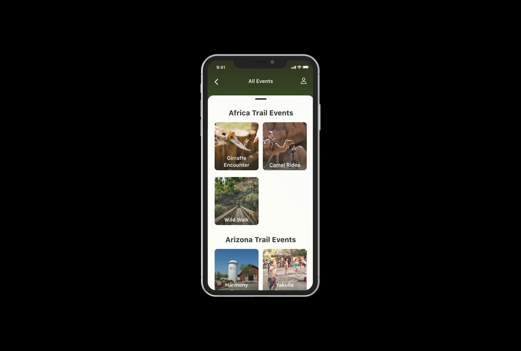
Ways to Purchase and Schedule Events.
Design a purchase ticket screen and schedule event tabs to allow visitors to utilize all activities.
These features needed to be included in the final design to meet the expectation zoo visitors had. To accomplish this, I needed to start thinking about how users would flow through the app and develop these screens first.
I tested the app with 5 different users giving them 6 different tasks, 2 of them in-person and 3 remotely. Their feedback throughout the test was extremely crucial as I purposely gathered people I knew who were non-tech savvy and tech-savvy. This would allow me to see the app's flaws and see where I could improve on making it more universal.
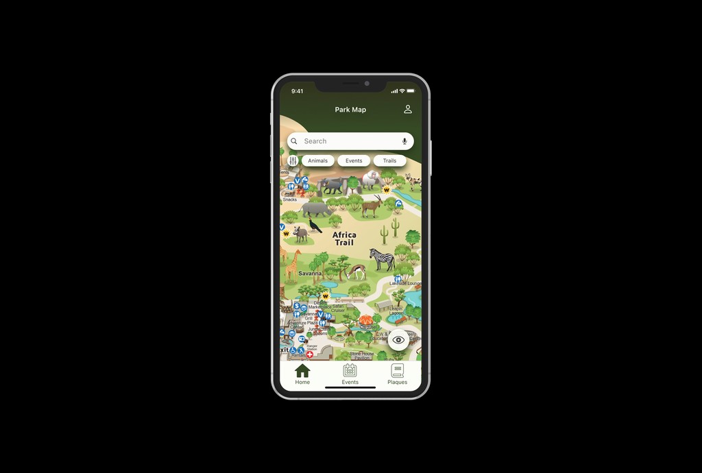
Based on user input, I realized that the park map really had everything a home screen would need and users felt the same way. I was also able to see how users interacted with the design. I initially created just enough screens to complete the task that I believed was the most optimal but I very quickly realized users felt other methods were the correct way to get to A-Z. The app didn’t give users enough clarity on how to complete their tasks.
During testing, I noticed that when users tried to find their way to a task, it took them longer than I expected. This was likely due to the fact that my design lacked clarity and was beginning to clutter the user. To solve this problem, I removed some of the clutter and made it possible for users to have an audio player by selecting a tab. I removed the orange color as it clashed with our CTAs and reworded the tabs so that users could assume what content would be there upon selection.
After completing certain tasks, I would purposely introduce a new task that would require them to navigate back to the park map. However, to my surprise, 5 out of 5 users selected the home button on the bottom tab. When I asked why they performed the action, users simply stated “It feels like home”, and “I thought it was home; if it isn’t, it should be.” Although a small change, it was important to understand that users want this pretty park map screen to be where they called home.
Users made the app their own by bringing habits they had from the real world. The most common reason for selecting the pricing tab was "I like to see the price before purchasing something. It made complete sense but it was something so small I didn’t originally think of it. I decided to add a new tab that lets users view pricing before purchasing with updated colors and floating buttons for easy access.
In our second round of usability testing, we did not encounter many issues. Most of the feedback we received was quite wide-ranging and there wasn’t a central theme this time around. The main issues from users involved zooming in and out of the map. I was not able to create this using Figma—a limitation that didn’t come up during my initial user testing. However, I was able to bring in users from my user interviews to help with completing my second round of testing and these users were ecstatic about seeing their feedback on screen, as well as having a chance to explore the app themselves. They thought the app felt fun and super interactive!
